Discover best practices for museum signage and wayfinding, from accessibility to digital integration, to enhance visitor navigation and experience.
.svg)


Great navigation begins by understanding how people process complex spaces. When guests enter a cultural institution, they face a heavy cognitive load. They are processing architectural scales, ticket queues, security checks, and noise levels. When directional systems add visual clutter, navigation anxiety sets in quickly.
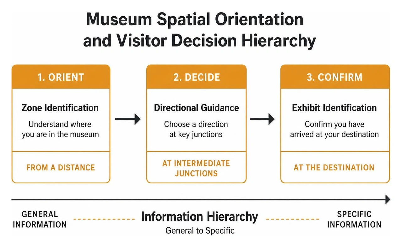
Spatial hierarchy solves this problem by structuring information from the general to the specific. High-level zone identifiers orient guests from a distance, directional cues guide movement at intermediate junctions, and identification plaques confirm arrivals at specific exhibits.
Research from the Asian Art Museum revealed that around half of visitors did not follow the recommended path through the building. In that same study, one-third of participants found aspects of the facility confusing, causing many to miss major collection highlights entirely. When navigation is intuitive, visitors move with confidence and absorb more of the collection around them.
Cultural spaces should invite wandering without creating frustration. Guiding visitors does not mean locking them into a rigid, single-file corridor. By establishing zoned color coding and clear visual breadcrumbs, spaces allow guests to explore freely while always knowing how to return to core pathways.
The V&A East Storehouse offers a prime example of intuitive routing across vast collections. Holding over 2.3 million objects accessible to the public, the facility operates like a working operating system for culture. Rather than forcing a single narrative sequence, its visual framework uses color-coded zones, clear onboarding panels, and distinct directory nodes. Guests can follow their curiosities, check out archives, or participate in programs like the 'Order an Object' initiative, which saw over 1,000 objects requested shortly after opening. This approach provides clear orientation while encouraging independent exploration.
Wayfinding functions best when it serves as a natural extension of an institution's visual character. Every sign, typography choice, color palette, and environmental graphic communicates the tone of the organization.
When developing a unified visual presence, pairing thoughtful environmental design with strategic brand identity and logo design ensures that the physical space matches the institution's public voice. Our team applied these foundational ideas during our visual storytelling work for The Mint Museum, aligning physical signage and print collateral with the institution's distinct identity.
To create a consistent visual language across your space, consider these core graphic standards:
Inclusive navigation ensures that every guest, regardless of sensory, cognitive, or physical abilities, can navigate an institution with dignity and ease. Universal design principles integrate accessibility directly into the primary visual language rather than treating it as an afterthought.
Compliance with the Americans with Disabilities Act (ADA) provides the baseline for public navigation systems. True universal accessibility goes beyond minimum standards to build an effortless environment for everyone.
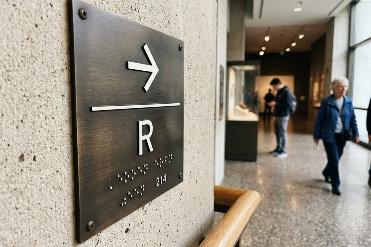
During its multi-year wayfinding overhaul from 2016 to 2023, the Cincinnati Art Museum synchronized exterior updates with the construction of its accessible Art Climb ramp while integrating tactile lettering and braille across interior gallery markers. Providing braille directly on gallery identification plaques exceeded standard guidelines and gave visitors independent access across every wing.
To meet robust accessibility standards:
Visual literacy transcends spoken language. Incorporating globally recognized pictograms alongside multilingual text ensures international visitors, school groups, and non-native speakers move easily through physical spaces.
During our exhibition branding for Greensboro History Museum, establishing clear visual landmarks and accessible interpretive hierarchies helped visitors connect directly with historical narratives.
When implementing multilingual and icon-based wayfinding:
Wayfinding should feel like a natural part of a building's architectural flow. By coordinating signage placement with sightlines, natural lighting, and circulation paths, physical markers support the space without cluttering the environment.
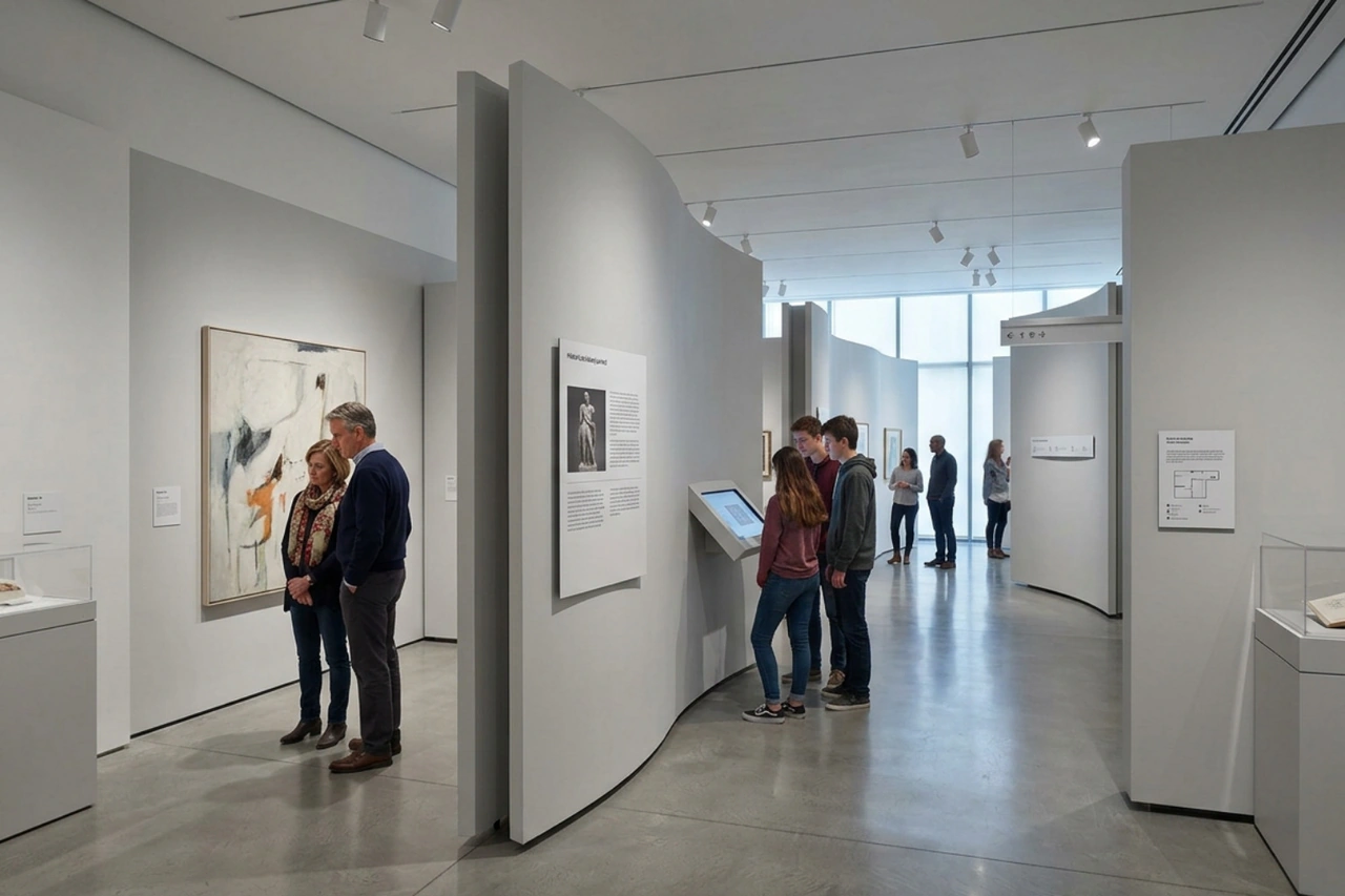
Effective wayfinding works directly with a building's geometry and illumination patterns. Exterior signage can use natural sunlight to cast dynamic shadows that shift throughout the day, while interior spaces benefit from lighting embedded directly into display hardware.
In dim exhibition spaces or media wings, LED-embedded acrylic signs provide gentle orientation without washing out light-sensitive collections. Aligning signage dimensions with wall joints, structural pillars, and natural sightlines creates a cohesive, calm atmosphere that lets the collection take center stage.
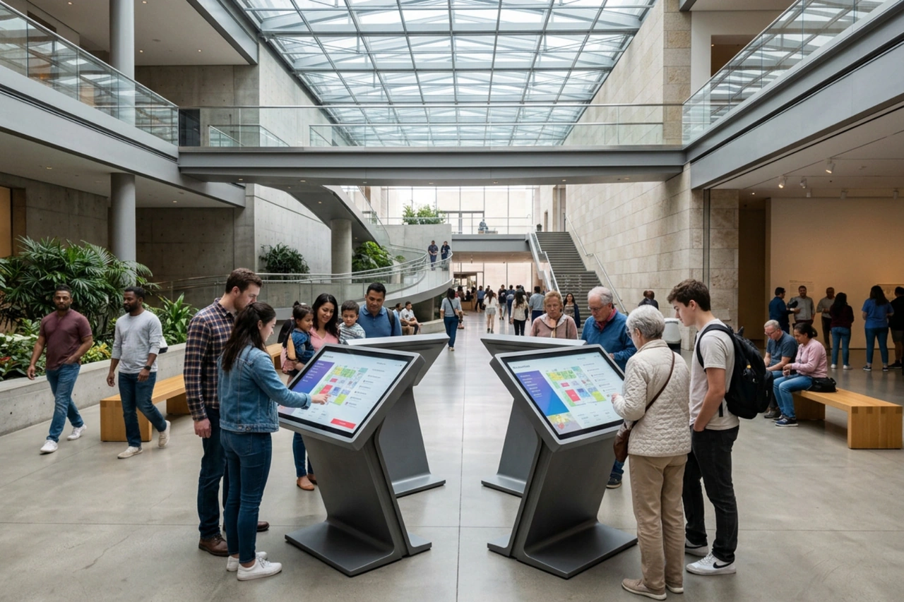
Cultural institutions host rotating exhibitions, rehang permanent collections, and host special events throughout the year. Static signage alone cannot accommodate frequent spatial reconfigurations. Combining durable architectural markers with flexible, modular systems creates a framework that adapts effortlessly over time.
Bridging the physical-to-digital gap also extends to online visitor preparation. Reviewing digital gallery presentation and museum website design helps institutions build online maps and event schedules that mirror their physical floor plans perfectly.
| Feature | Static Architectural Signage | Flexible Digital Wayfinding |
|---|---|---|
| Primary Function | Permanent orientation, amenities, safety, ADA | Dynamic scheduling, daily events, temporary exhibits |
| Longevity | 5 to 15+ years | 3 to 7 years (hardware updates) |
| Maintenance Needs | Low (occasional cleaning and repair) | Moderate (software updates, screen servicing) |
| Flexibility | Fixed; requires physical panel replacement | Instantaneous updates via content management systems |
| Best Locations | Main corridors, restrooms, elevators, exits | Central atriums, ticketing halls, rotating galleries |
Designing a navigation system requires structured research, real-world prototyping, and clear metrics. Testing signs with actual visitors ensures that concepts work in practice before full fabrication and installation.
To identify navigational bottlenecks, gather direct observations from front-of-house staff, security guards, and ticketing teams. Frontline teams field questions every day about missing amenities, confusing stairwells, and hidden exits, making their insights invaluable.
Observational route tracking reveals the real choices visitors make at junctions. Pairing these observations with community workshops ensures the resulting signage serves local audiences, school groups, and accessibility advocates effectively.
Measuring navigation effectiveness requires tracking quantitative and qualitative metrics after installation:
When preparing comprehensive wayfinding programs, detailed briefs are essential. Clear fabrication guidelines, material specifications, and installation scopes ensure public tenders run smoothly from concept to completion.
Wayfinding systems rely on four distinct categories of signs:
Historic structures often have restrictions that prevent drilling into historic masonry, plaster, or woodwork. Non-invasive solutions include freestanding directional totems, weighted base plates, projected light wayfinding, floor graphics that use conservation-grade adhesives, and mobile interactive guides accessed via QR codes.
Comprehensive wayfinding projects typically take between 6 and 24 months, depending on institutional scale, stakeholder reviews, and construction coordination. Timelines divide into research, design development, physical prototyping, fabrication, and installation. Phased implementation allows institutions to refresh exterior branding and critical ADA markers first, followed by interior galleries and rotating wings.
Museum navigation systems shape how visitors experience every collection, exhibition, and public program. By combining clear spatial hierarchy, accessible universal design, and responsive physical materials, institutions can create welcoming environments that empower guests to explore with confidence.
At Social Design House, we are a Charlotte-based 10-person creative studio with 16 years of experience operating as a fractional creative team. Our core services include brand identity and strategy, web design and development (Webflow and WordPress), content creation and copywriting, performance marketing, and our AI Brand Framework, which we built to help organizations define their market position. We operate as an extension of your team, helping cultural institutions build cohesive visual systems from initial strategic positioning to physical visitor touchpoints.
Explore our creative partnership for arts and museum environments and learn more about our creative services for cultural institutions to discover how thoughtful design helps your organization find your sweet spot. Excited to continue building engaging visitor experiences across cultural spaces.