Find the right wine label design agency to elevate your brand on the shelf, from storytelling to sustainable packaging.
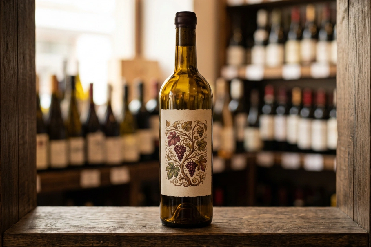
.svg)


A wine label design agency helps wineries turn a bottle into a clear brand signal, one that catches attention on the shelf and gives buyers a reason to pick it up. The right partner combines brand strategy, packaging design, storytelling, print knowledge, and a solid grasp of what makes a wine range feel distinct.
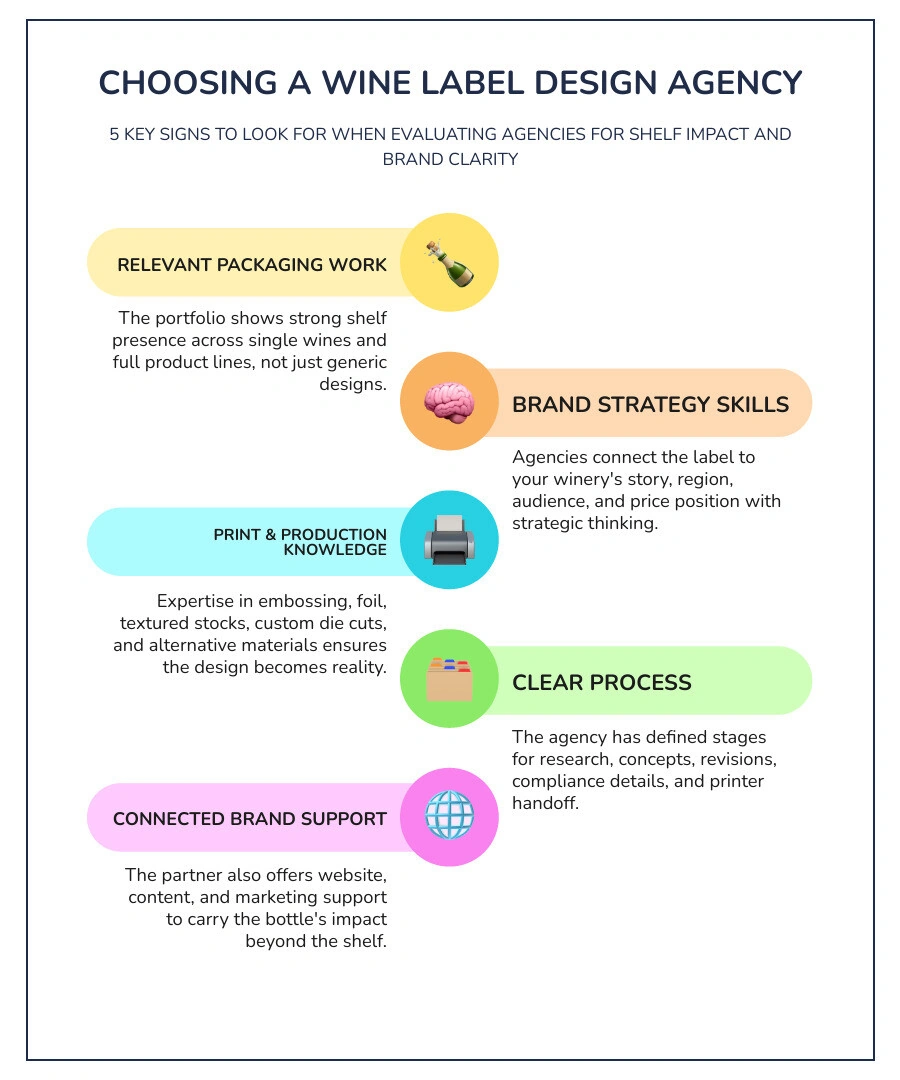
For a quick way to compare agencies, look for these five signs:
Wine packaging is becoming more expressive. Bold color, tactile materials, custom typography, and playful illustration can all create a memorable first impression. At the same time, a simple label can still have huge impact when every visual choice supports a focused brand idea. Clarity is a gift, especially when buyers have seconds to choose.
I am Ben Visser, founder of Social Design House, a Charlotte-based creative studio with 16 years of experience helping growth-focused brands build stronger identities, websites, and marketing. As a fractional creative team, we bring brand strategy, design, and practical execution to each wine label design agency partnership, then carry that clarity into the next stage of the brand.
Standing out in a retail wine shop or restaurant display requires more than a clean logo pasted onto paper. Buyers scan crowded retail shelves in seconds, making split-second decisions guided by visual weight, color harmony, and tactile detail. A specialized wine label design agency understands how to turn those brief glances into real interest.
Typography has shifted from a basic tool for listing grape varieties into a core visual anchor. Modern labels treat lettering as artwork, using custom calligraphy, bold serifs, or stripped-down sans-serif fonts to communicate brand personality instantly. When combined with expressive color palettes, the visual balance helps buyers grasp the character of the bottle before reading a single line of tasting notes. Research from industry publications like Wine Label Design Is More Important Than You Think reinforces how heavily visual presentation influences perception and willingness to purchase.
Our team at Social Design House builds complete packaging systems through our Beer & Wine Industry Design & Branding Services. We focus on building clear connections between the physical bottle on the shelf and the broader brand identity, helping wineries build a lasting impression across every touchpoint.
A great wine label acts as an ambassador for its vineyard, terroir, and origin story. Integrating cultural and regional markers into visual design creates a grounded connection that resonates with modern wine drinkers.
Creative agencies accomplish this by incorporating local folklore, historical architecture, regional geography, or indigenous artistic styles directly into the label artwork. Here are several notable examples of story-driven label design:
When regional elements guide design, every bottle tells a distinct story that buyers love to share around the dinner table.
Wine label aesthetics often swing between vibrant narrative playfulness and restrained minimalism. Both styles work exceptionally well when executed with intention.
Playful and character-driven design breaks away from traditional formal conventions. For instance, Antídoto Siete Pasos uses a seven-wine lineup where each bottle features a distinct illustrated character representing different Spanish regions of origin. Similarly, Circus Wine uses energetic graphics and theatrical imagery to bring a sense of fun to everyday drinking.
On the opposite end of the spectrum, bold minimalism relies on spatial harmony and precise visual cues:
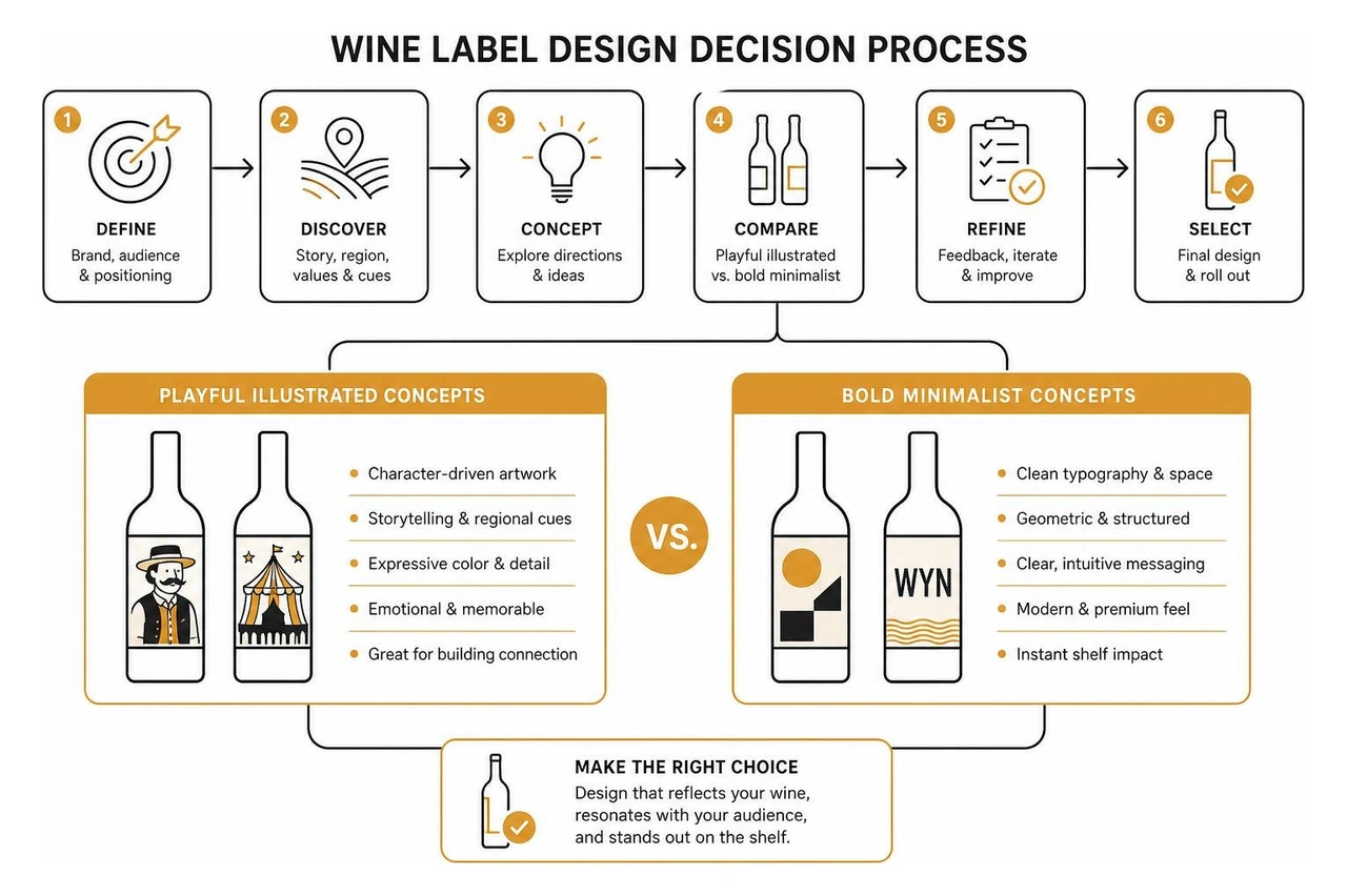
Whether choosing bold character illustrations or clean geometric minimalism, the goal remains the same: create visual clarity that grabs attention and reflects the personality of the wine inside.
The physical feel of a label creates an immediate tactile impression. Modern wine label design routinely pairs visual creativity with tactile embellishments such as:
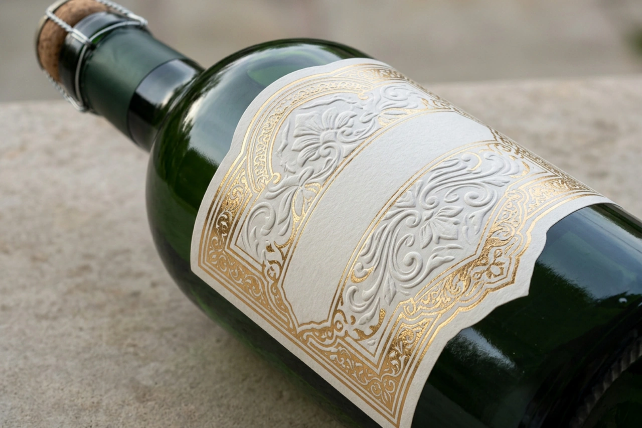
These physical finishes add a layer of craftsmanship that feels premium in hand. The table below compares traditional glass label formats with modern paperboard and eco-packaging innovations:
| Packaging Option | Primary Materials | Key Visual & Tactile Features | Environmental & Logistical Benefits |
|---|---|---|---|
| Traditional Glass Packaging | Glass bottle, cotton/paper label stock | Foil stamping, embossing, die cuts, textured paper feel | Classic premium presentation, highly familiar to consumers |
| Eco-Paperboard Packaging | Compressed recycled paper, recyclable sleeve, natural inks | Full 360-degree printed outer shell, custom matte textures | Extremely lightweight (1 oz empty), low shipping footprint |
Sustainable packaging is moving from a niche experiment into a primary consideration for modern beverage brands. Innovations like the Paperboy paper wine bottle demonstrate how creative engineering can lower environmental impact without losing shelf presence.
The Paperboy bottle is constructed from compressed recycled paper printed with natural inks, housing a recyclable inner sleeve. An empty paper wine bottle weighs only an ounce, drastically lowering transport weight, fuel consumption, and shipping expenses.
From a practical standpoint, innovative paper bottles also perform under real-world conditions. The compressed paper structure can sit in an ice bucket for up to three hours without dissolving or losing structural integrity.
While alternative materials offer substantial environmental benefits, wineries must also balance supply chain availability, bottling line adjustments, and consumer perception. A specialized design partner helps navigate these production details while ensuring the visual design communicates quality.
Wine packaging offers an incredible medium for corporate gifts, seasonal client tokens, and self-promotional campaigns. Highlighting craftsmanship through custom packaging leaves a lasting impression on partners and clients.
Unique concepts like BRND NWS Wine Label wrapped wine bottles in custom newsprint packaging featuring annual agency marketing headlines, turning a client gift into a creative conversation piece. In another project titled Let it grow, a creative studio transformed 100 empty wine bottles by hand-illustrating each white-painted bottle as a client appreciation gift.
These projects show how custom die cuts, hand-drawn art, and creative wrapping turn a bottle into a memorable keepsake.
Choosing the right wine label design agency requires assessing strategic depth alongside visual talent. A strong creative partner acts as an extension of your team, understanding print production constraints, regulatory requirements, and retail strategy.

When evaluating potential agency partners, look for teams that combine brand strategy with practical packaging execution. Our approach to beverage branding focuses on building clear, consistent systems. You can read more about our strategic process in How Do You Approach Branding for Beverages?.
We always encourage wineries to evaluate foundational design capabilities through an agency's Brand Identity & Logo Design Services. Seeing how an agency builds brand guidelines, selects typography, and handles visual hierarchy across different media gives you confidence in their ability to execute a bottle label.
For a practical example of heritage beverage branding, explore our Albert Bichot Case Study to see how strategic design enhances wine presentation across classic portfolios.
Reviewing an agency's portfolio goes beyond admiring pretty pictures. Look for specific indicators that show the studio can manage complex, real-world packaging challenges:
A bottle label rarely works in isolation. Ensuring your physical packaging aligns with your online presence is essential for long-term growth. Wineries and importers should review our guide on the Most Important Things to Consider When Building a Wine Importer Website to make sure digital touchpoints match the quality of the bottle packaging.
Tactile finishes like metallic foil stamping, blind embossing, debossing, and custom die cuts offer immediate shelf appeal. Textured cotton or felt papers give bottles a premium hand-feel, while modern matte finishes and clear spot UV coatings add contrast and depth under retail lighting.
Most retail wine purchases are made by consumers scanning shop shelves without prior tasting. A custom label communicates price point, quality, region, and taste profile in seconds. Clear typography, distinct color palettes, and memorable illustrations attract attention and give buyers confidence in their choice.
Innovative packaging solutions such as compressed recycled paper bottles printed with natural inks offer striking 360-degree design canvases while lowering bottle weight to around one ounce. These materials retain structural durability, including sitting in ice buckets for up to three hours without degrading.
Finding the right wine label design agency comes down to choosing a team that balances creative vision with strategic discipline and technical print knowledge. The right partner helps your winery stand out on crowded retail shelves, connect with your audience, and build long-term brand equity. Be the meeting you want to go to by selecting an agency partner that brings clarity, enthusiasm, and focus to every collaborative review.
At Social Design House, we operate as a Charlotte-based 10-person creative studio with 16 years of experience working as a fractional creative team. Our core services include brand identity and strategy, web design and development in Webflow and WordPress, content creation and copywriting, performance marketing, and our AI Brand Framework. We love helping growth-focused beverage brands and wineries Find your sweet spot.
Excited to continue building stand-out packaging and brand identities with your team! Connect with us through our Charlotte Branding and Website Design Agency team to start your next wine label design project.