Diagnose why your website not converting with this expert checklist covering traffic quality, UX friction, trust signals, and CRO testing.

.svg)


When looking at overall performance, we first separate visitor acquisition from on-page behavior. A common mistake is assuming that thousands of visits automatically translate to pipeline growth. If acquisition channels bring people who have no intent to buy, or if the page creates friction for high-intent visitors, conversion rates suffer.
According to research on conversion benchmarks, the median underperforming site averages 3.4 distinct friction issues across messaging, layout, and performance. Differentiating between traffic fit and page friction begins by analyzing acquisition channels in Google Analytics 4.
| Traffic Indicator | High-Intent Signals | Low-Intent Signals |
|---|---|---|
| Primary Sources | Specific organic search, targeted email, direct visits | Broad social feeds, untargeted display ads, generic referrals |
| Bounce Behavior | Low bounce rate on desktop, deep scroll depth | Immediate bounce across all devices within 5 seconds |
| Session Duration | Visitors spend over 45 seconds reviewing content | Visitors stay for less than 15 seconds |
| Interaction | Clicks on navigation items, pricing, and case studies | Single-page exit with zero interaction |
| Drop-Off Root Cause | Page friction, confusing checkout, missing trust elements | Audience mismatch, misleading ad copy, irrelevant search queries |
If bounce rates are high only on paid social or broad display campaigns, the issue is traffic quality. If visitors from high-intent organic search, direct links, and targeted email campaigns all leave without acting, the page experience itself is broken.
A traffic-page mismatch happens when the promise in an ad, social post, or search snippet does not match the content on the landing page. In advertising, this is known as broken ad scent.
When a search ad highlights a specific service but directs the user to a generic homepage, the visitor faces unnecessary cognitive work. Most website visitors stay on a page for less than 15 seconds. If they must hunt through navigation menus to find what was promised in the link, they leave. Understanding how to attract consumers online means aligning campaign messaging, design style, and offers directly with the destination page.
Before assuming a website has a design flaw, verify whether enough qualified users are reaching it. Data from Google Search Console helps distinguish a discoverability problem from a conversion problem.
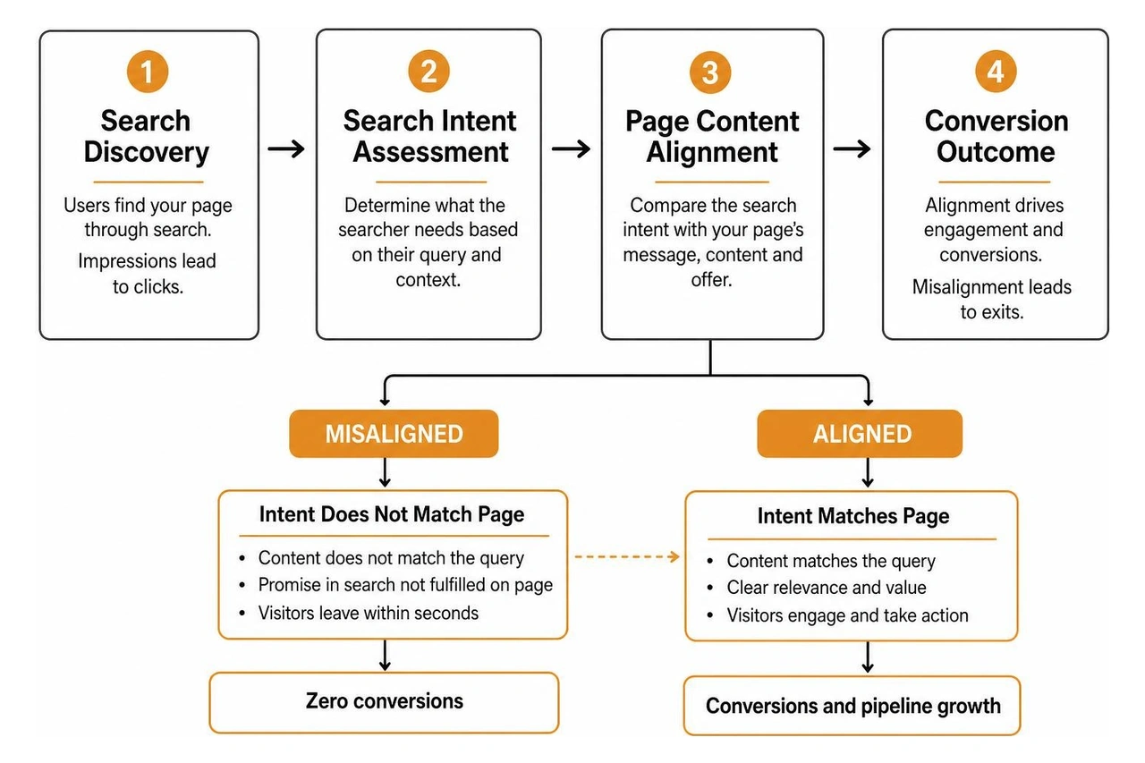
When organic search impressions are high but click-through rates remain low, page titles and meta descriptions are failing to communicate relevance in search results. When clicks are high but on-page conversions remain zero, search intent does not match the page content. Aligning your website content with buyer queries through a comprehensive SEO / AEO / GEO strategy ensures that search engines and AI recommendation systems send qualified visitors to pages designed for their specific needs.
A site that fails to guide attention creates decision fatigue. When a visitor lands on a screen filled with competing banners, vague slogans, and multiple links, cognitive load increases rapidly. Visual hierarchy should guide the eye directly from the main promise to supporting proof, ending at an unmistakable next step.
The 5-second test provides rapid feedback on positioning clarity. Show your homepage or primary landing page to an objective person for exactly five seconds, then hide the screen and ask three questions:
If the tester cannot answer accurately, your positioning is too vague. In our work as a fractional creative team, we find that clarity is a gift. A visually modest page with crystal-clear positioning consistently outperforms an ornate layout with confusing messaging.
Unclear value propositions above the fold affect roughly 68% of non-converting websites. Many businesses default to internal jargon, clever puns, or feature-heavy lists that ignore the visitor's core objective.
Effective messaging leads with tangible outcomes. Instead of describing technical specifications, state the exact problem you solve and the result you deliver. Implementing an intentional digital user experience strategy ensures that your hero headline immediately answers what you do, who you serve, and why your solution matters.
Weak, vague, or buried calls to action affect about 61% of non-converting sites. A button labeled "Submit" or "Learn More" provides zero momentum.
Specific CTAs perform 202 percent better than generic ones. Replace ambiguous labels with benefit-driven actions such as "Get Your Free Proposal," "Start Your Free Trial," or "Schedule a Strategy Call."
Even the clearest messaging fails if technical friction stops visitors from interacting. A seamless experience requires fast loading times, responsive mobile layouts, and reassurance against perceived risk.

More than 60% of web traffic now comes from mobile devices. However, many desktop-designed sites break down on smaller screens due to oversized media, overlapping elements, and tiny touch targets.
Speed directly dictates user retention. Research shows that 53% of mobile visitors abandon a page that takes more than three seconds to load. In addition, every additional second of load time after three seconds costs roughly 7% more conversions. As highlighted in analysis on 2026 conversion trends, modern technical audits must prioritize Core Web Vitals, specifically Largest Contentful Paint (LCP) under 2.5 seconds and mobile tap targets sized to at least 44 by 44 pixels.
Visitors arrive at your site with natural skepticism. Without physical interaction, they rely entirely on on-page trust signals to evaluate your credibility before sharing contact details or payment information. Missing social proof above the fold impacts roughly 57% of underperforming websites.
Building authority requires clear signals near every decision point:
Integrating verified social proof across your funnel is a proven method for businesses evaluating how to generate leads online with confidence.
Quantitative metrics show where visitors leave, while qualitative tools reveal why they leave. Combining these data sources allows you to make informed layout and copy adjustments. Understanding how analytics factor into UX work helps teams replace subjective opinions with clear behavioral evidence.
Behavioral mapping software uncovers hidden friction points across key pages:
Once analytics reveal where users drop off, formulate clear testing hypotheses. Rather than redesigning entire layouts at once, test single variables to establish reliable cause-and-effect relationships.
Experiment with headline variations, CTA contrast, social proof placement, and form field reductions. Pairing conversion rate testing with automated post-visit sequences through marketing automation captures leads who hesitate during their initial session.
A site with substantial traffic and zero conversions typically suffers from an intent mismatch or hidden technical blockers. If broad ads attract visitors looking for free information rather than paid services, traffic volume will not produce revenue. If traffic is qualified, the barrier is usually an ambiguous headline, buried action buttons, lack of social proof, or a broken mobile layout that prevents form submissions.
You can achieve meaningful gains quickly by making focused, high-impact updates:
Targeted conversion optimization is best when your current site has a solid technical foundation, clean brand visual standards, and steady traffic, but lacks clear messaging or effective CTAs. Focused adjustments to headlines, proof elements, and button styling produce immediate results without long development cycles.
A full rebuild becomes necessary when legacy content management platforms restrict mobile responsiveness, outdated branding damages credibility across all touchpoints, or site architecture requires fundamental restructuring. Determining when UX strategy should happen ensures that structural updates solve root usability challenges before development begins.
Diagnosing conversion issues requires a structured approach across traffic relevance, messaging clarity, technical reliability, and visitor trust. When you methodically identify drop-off causes and implement focused changes, user hesitation decreases and engagement grows.
At Social Design House, our 10-person creative studio in Charlotte brings 16 years of experience helping growth-focused brands find their sweet spot. By combining brand strategy, copywriting, web design in Webflow and WordPress, and performance marketing, our team builds digital experiences that turn qualified visitors into long-term customers. Excited to continue refining your user journey, removing friction points, and scaling measurable business results together.