The Ultimate Guide to Art Gallery Logo Design Options - Learn about art gallery logo design
.svg)


Strategic art gallery logo design relies on creating a balanced frame for artistic expression. Unlike retail brands that use loud logos to grab attention in crowded aisles, art galleries need a visual mark that establishes a clear identity without stealing focus from featured artists. The fundamental visual identity elements of a successful gallery logo include bespoke typography, thoughtful shape psychology, and intentionally quiet color palettes.
Typography psychology plays an massive role in shaping visitor expectations. Contemporary art spaces often choose custom lettermarks with high-waisted capitals or subtle wabi-sabi details that feel human, refined, and timeless. Traditional fine art institutions might use classic serif letterforms with hand-crafted adjustments to signal prestige and historical authority.
Color choices require equal restraint. Monochrome palettes, black, white, and subtle warm grays, are the foundation of art gallery branding because they work seamlessly next to any medium or color palette an artist might bring to a exhibition. Some galleries draw their secondary accent colors directly from their physical interior architecture. Incorporating exposed brick tones, blue ceiling rafters, or polished concrete grays into the brand system creates a smooth transition between digital touchpoints and the physical gallery space.
Custom monograms and abstract geometric marks offer strong visual anchors when typography alone isn't enough. Geometric shapes like circles, squares, or open frames can symbolise inclusion, spatial orientation, or a window into artistic discovery. Exploring strategic Brand Identity & Logo Design helps galleries build logo marks that look right in every context, from high-end print collateral like the Graphic GarMINT exhibition identity to tiny digital favicons.
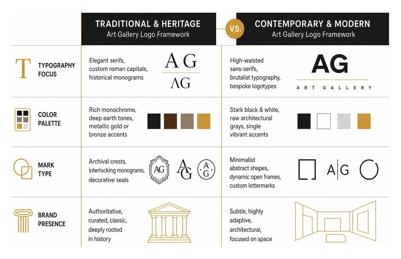
| Design Element | Traditional & Heritage Art Galleries | Contemporary & Modern Art Galleries |
|---|---|---|
| Typography Focus | Elegant serifs, custom roman capitals, historical monograms | High-waisted sans-serifs, brutalist typography, bespoke logotypes |
| Color Palette | Rich monochrome, deep earth tones, metallic gold or bronze accents | Stark black & white, raw architectural grays, single vibrant accents |
| Mark Type | Archival crests, interlocking monograms, decorative seals | Minimalist abstract shapes, dynamic open frames, custom lettermarks |
| Brand Presence | Authoritative, curated, classic, deeply rooted in history | Subtle, highly adaptive, architectural, focused on space |
Modern gallery branding has moved toward clean geometric forms, custom typography, and minimalist lettermarks that stay clear and legible across modern screens. We see more institutions using brutalist graphic aesthetics, raw typographic layouts, unpolished edges, and bold structural lines that reflect contemporary architectural art spaces.
Another huge shift is layout spacing flexibility. Modern gallery logos are designed as responsive spatial systems rather than fixed, unchangeable graphics. Generous letter-spacing (tracking) gives wordmarks room to breathe, creating a visual pause that prepares the viewer to engage with art. Incorporating tiny wabi-sabi details, intentional imperfections, asymmetric cuts, or custom-drawn serifs, gives minimalist wordmarks a unique personality. To see how these principles come together in practice, check out our Logo Collection Work.
Designing an effective gallery logo requires avoiding a few common traps:
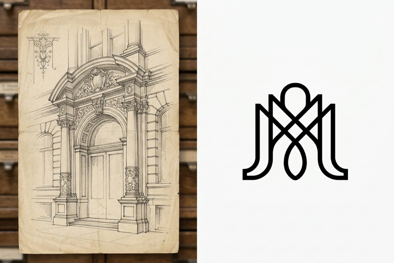
Rebranding an established art gallery or cultural museum requires a careful balance between preserving history and introducing modern design standards. Historical institutions often house rich archives that provide genuine inspiration for contemporary rebrands.
Looking to institutional history yields incredible results. For instance, when the National Portrait Gallery updated its visual identity, designers uncovered a forgotten sketch by its first director hidden deep within archives for 168 years. That archival drawing became the foundation for a sleek, modern interlocking monogram that bridging past and present.
Similarly, iconic institutions have long set the standard for timeless identity design. The Tate famously created 70 different blurred logo variations during its major rebrand, representing diverse artistic perspectives before distilling its mark into an adaptive modern icon. The Victoria and Albert Museum (V&A) logo, designed in 1989, remains a landmark example of typographic elegance, effortlessly combining a classic letterform with modern minimalism.
In India, Gallery Espace preserved its legacy by modernizing its iconic galloping horse logo, originally created by legendary artist M.F. Husain in 1989. Likewise, examining how contemporary spaces refresh their visual identity after a decade of growth shows how institutions pull design cues from physical interior architecture and heritage surroundings.
When modernizing a legacy brand, one of the most effective strategies is decoupling icons from containers. Historical art logos often combined symbols and lettering inside restrictive badges, circles, or letters. By freeing graphic emblems from these tight frames, designers allow icons to stand on their own as modern visual marks across digital media and physical exhibition spaces.
Pairing these decoupled symbols with hand-tooled logotypes adds a layer of craft that standard system fonts simply cannot match. Customizing letterforms ensures the logo feels crafted, matching the quality of the art displayed within the gallery walls. If you are evaluating your own gallery identity, questions often arise around scope and process. We often address topics like Can you redesign an existing brand or website? and clarify strategic choices such as Can brand strategy be done separately from a redesign? to ensure institutions take the right path forward.
A gallery logo can also serve as a public statement about cultural heritage, community connection, and inclusivity. Today, art institutions are expanding their reach to engage broader, more diverse audiences, and their logos need to reflect that open mission.
For example, when major public galleries rebrand to honor Indigenous cultures, they often collaborate directly with community Elders. The National Gallery of Canada introduced a dynamic circular logo system inspired by the Algonquin-Anishinaabe concept of Ankosé, which translates to "everything is connected." This fluid visual system breaks away from rigid traditional frames, creating a flexible mark that symbolizes decolonization, continuous movement, and community inclusion.
Understanding the difference between your overarching gallery mission and your visual assets is key. Exploring What is the difference between brand strategy and brand identity? helps clarify how core institutional values shape outward visual marks. Developing a comprehensive Brand Strategy Service ensures that every typographic choice, layout rule, and color palette directly supports your gallery's long-term community goals.
An art gallery logo design must perform flawlessly across physical, digital, and spatial platforms. A system that looks stunning on a massive stone building entrance must remain crisp and readable when scaled down to a tiny digital viewing room or social thumbnail.
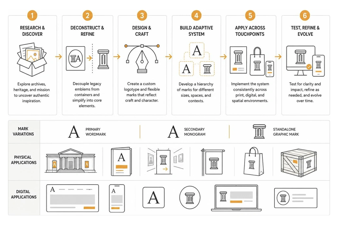
Creating a flexible master brand system involves designing responsive logo variations for different spaces:
Boutique galleries often pair clean modern typography with custom hand-drawn illustration marks. These illustrated accents add human craftsmanship to gallery print catalogs, tote bags, and exhibition banners without overwhelming the digital experience. To review real-world examples of responsive gallery branding, read our thoughts on building a Post: Modern Brand Identity.
The visual strategy for an art space depends directly on its business model and curatorial focus:
We start every gallery project with deep discovery, stakeholder alignment, and brand strategy. We analyze your gallery's curatorial vision, audience, physical architecture, and digital touchpoints to build a clear strategy before drafting visual concepts. Read more about our full approach here: How do you approach a brand identity project?.
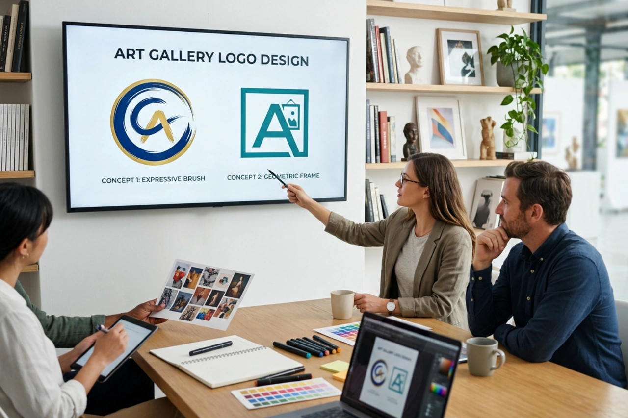
We focus on quality and strategic alignment over overwhelming options. We present distinct, fully developed strategic visual directions that show how the logo functions across gallery signage, digital viewing rooms, print catalogs, and mobile screens. Learn details about our presentation process: How many logo concepts will we see?.
If you know your gallery branding needs a refresh but aren't sure where to begin, we start with a brand strategy audit. We review your current visual assets, physical gallery touchpoints, website experience, and marketing goals to build a clear roadmap. Explore guidance for getting started at What if we need brand work but aren't sure where to start? and see how we integrate creative services at Do you offer brand photography or copywriting alongside identity work?.
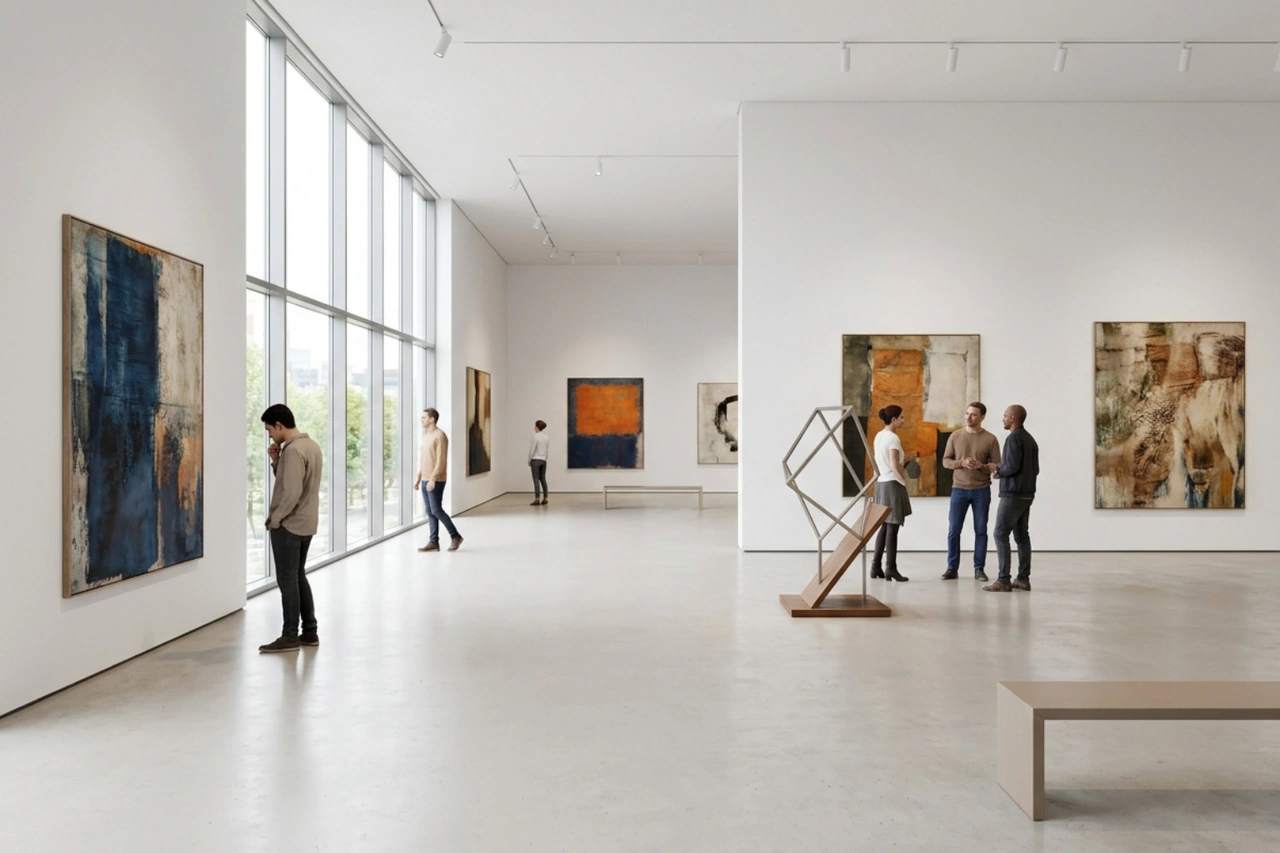
Crafting an effective art gallery logo design requires a strategic balance between distinct brand identity and understated visual restraint. A great gallery logo honors the institution's mission, adapts seamlessly across digital and physical spaces, and provides a timeless, neutral canvas that lets the exhibited art shine.
Social Design House is a Charlotte-based 10-person creative studio with 16 years of experience operating as a fractional creative team. We build brand identity and strategy, web design and development in Webflow and WordPress, content creation and copywriting, performance marketing, and our AI Brand Framework. We help arts organizations and cultural institutions establish clear, memorable identities that engage audiences and build long-term legacy. Simple, not easy, clarity is a gift, and we are always pumped to operate as an extension of your team to help you find your sweet spot.
Excited to continue pushing creative boundaries for arts organizations and cultural institutions. Explore our tailored arts and museum branding solutions and let's start a conversation about your gallery's visual identity.