Challenge
The franchise group needed an overarching brand that complemented the national Take 5 identity without feeling like a direct copy. Corporate guidelines were strict, yet the regional brand still needed its own personality and practical tools for everyday use. Everything from stationery to customer-facing collateral had to feel familiar to Take 5 customers while giving the Carolinas network a polished, consistent presence. The challenge was striking the right balance between national standards and regional distinction.
Solution
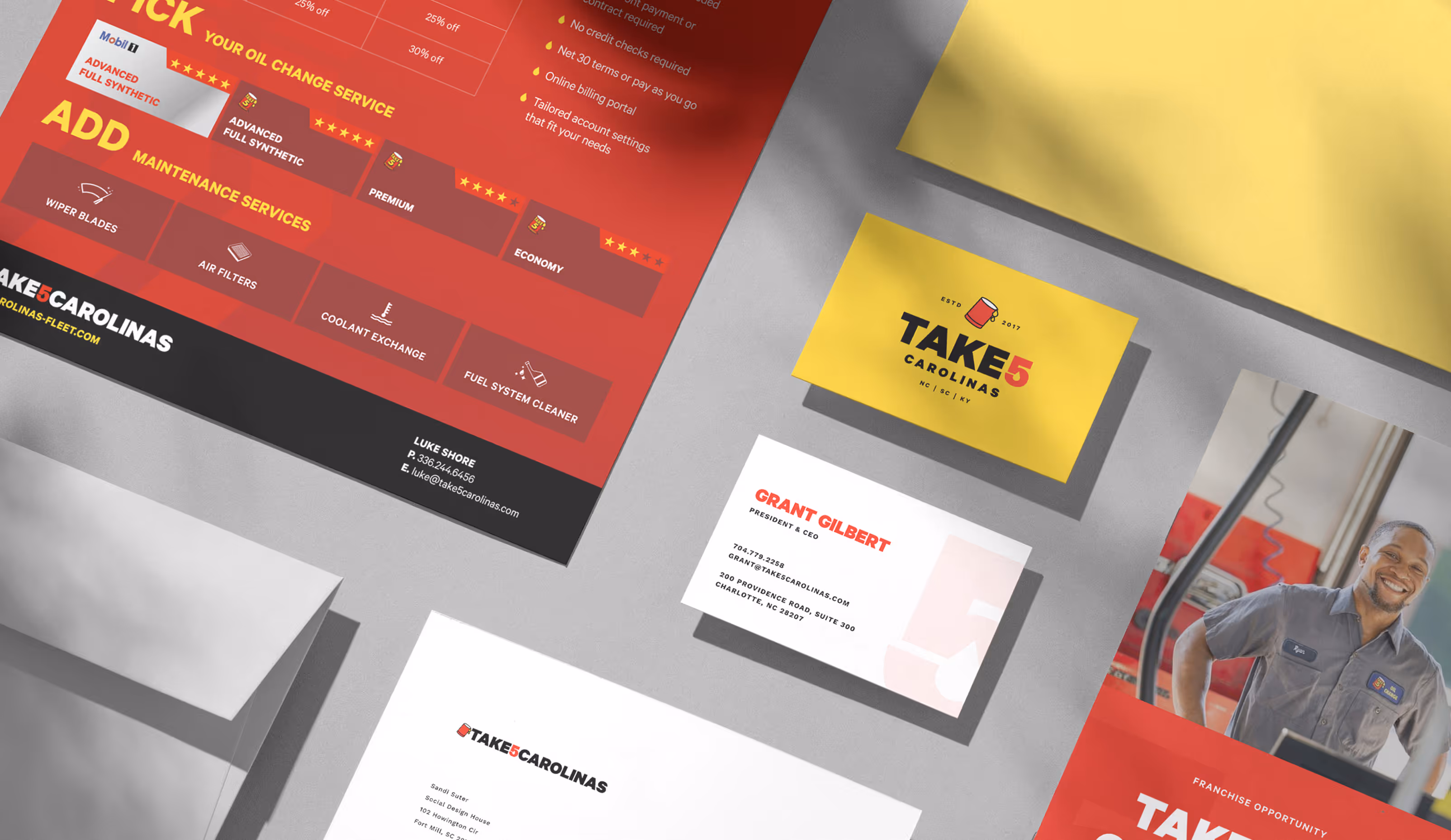
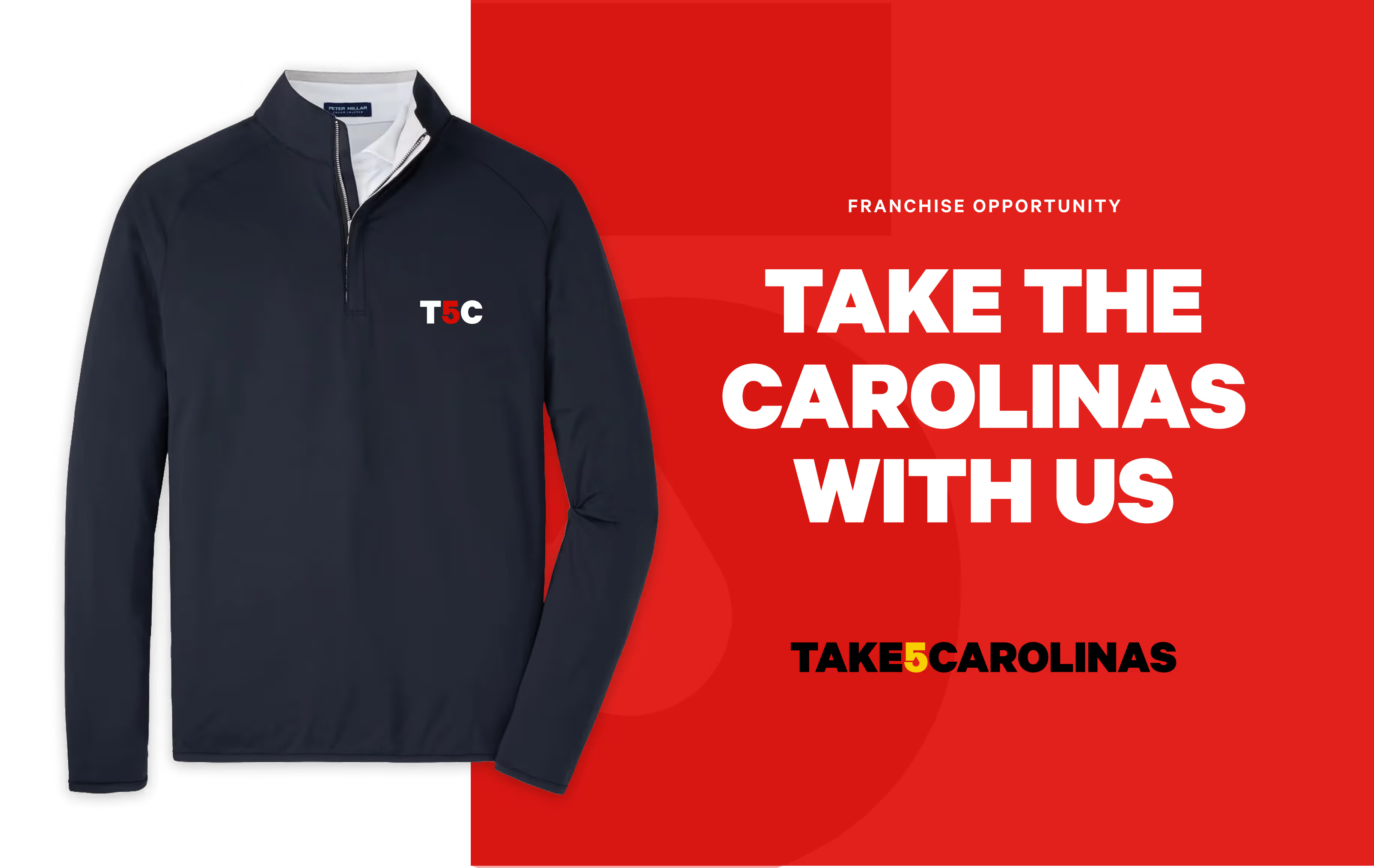
We designed a visual identity that honored the Take 5 corporate brand while introducing subtle touches that grounded it in the Carolinas. The logo carried forward the recognizable palette and structure but created space for a regional mark and naming system. This gave the franchise group a confident identity they could use across business cards, stationery, and local promotions.
With the identity established, we built out a suite of supporting materials to unify communication and customer experience across all locations. Flyers, printed collateral, and operational touchpoints were designed to be functional, consistent, and unmistakably part of the Take 5 family. The result was a regional brand that fit comfortably alongside its national parent while offering clarity, cohesion, and a sense of place.