Challenge
The company was evolving from debt collection into a new role as a crypto on/off ramp and qualified custodian. They were leveraging valuable money transmitter licenses across 50 states, while targeting B2B clients like investment advisors and crypto exchanges. But their existing brand carried baggage, including a CFPB enforcement action, that didn’t align with their next chapter. The challenge was to modernize without erasing their identity altogether.
Solution
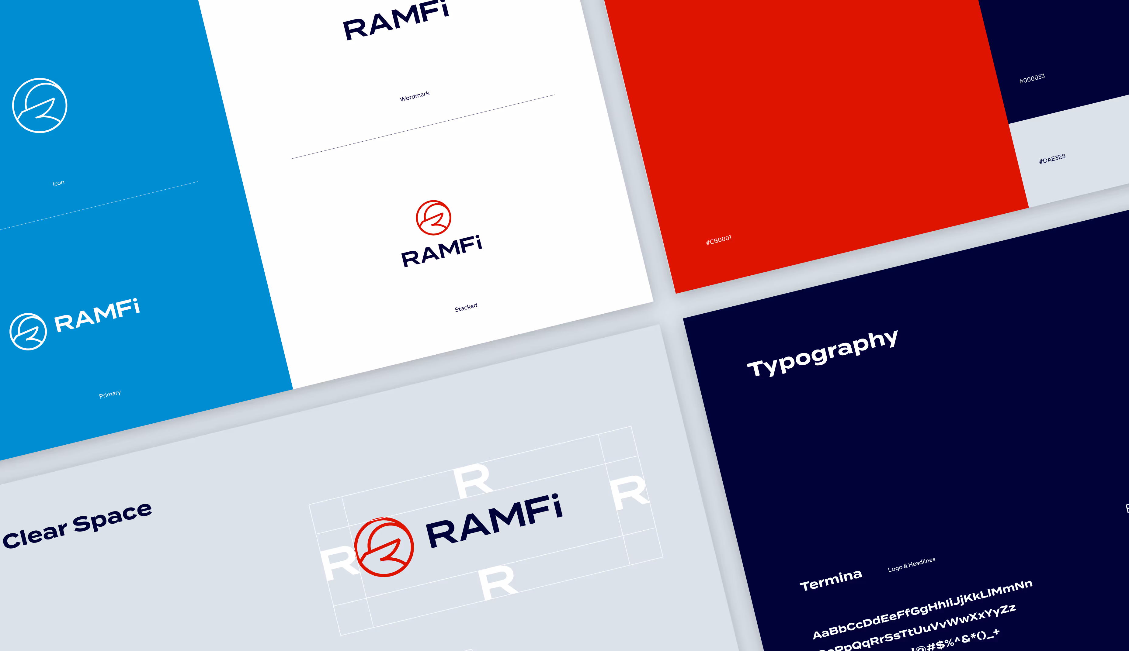
We focused on a light but meaningful refresh. The Ram icon was updated with sharper, more geometric lines, and paired with typography that felt sleek and confident in the crypto space. The color palette was punched up for greater impact, signaling energy and progress while maintaining a professional tone.
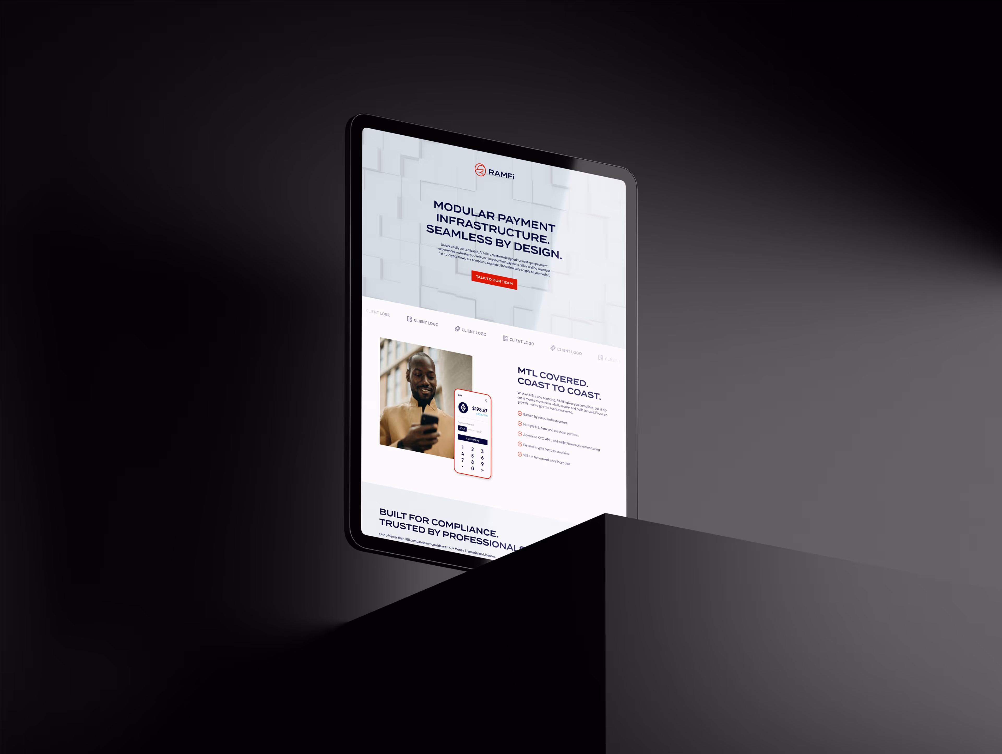
The result was a brand that stood taller and felt more in step with the industry it was moving into. While the project was intentionally small in scope, the updates provided RamFi with a foundation to reposition itself, rebuild trust, and step into the crypto market with a modernized look and feel.