Challenge
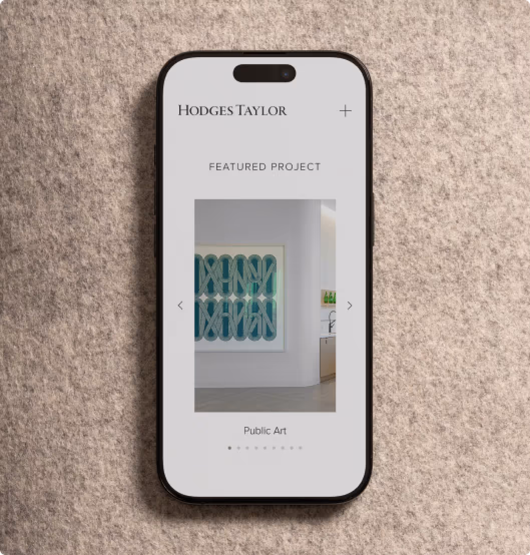
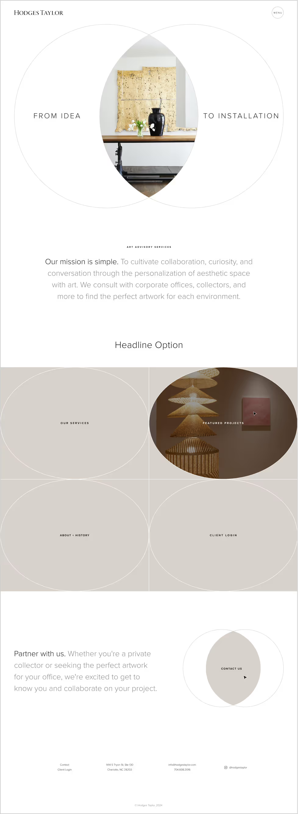
Hodges Taylor came to us with a website that no longer reflected their position in the high-end art world. Their brand was intentionally minimal, almost monastic in its restraint, which made telling a complex story feel a little like whispering in a crowded room. Their services had evolved, but the messaging hadn’t kept up, leaving potential clients unsure of the full range of what they offered. They needed a site that felt curated, confident, and contemporary, one that clarified their business while preserving their quiet sophistication.
Solution
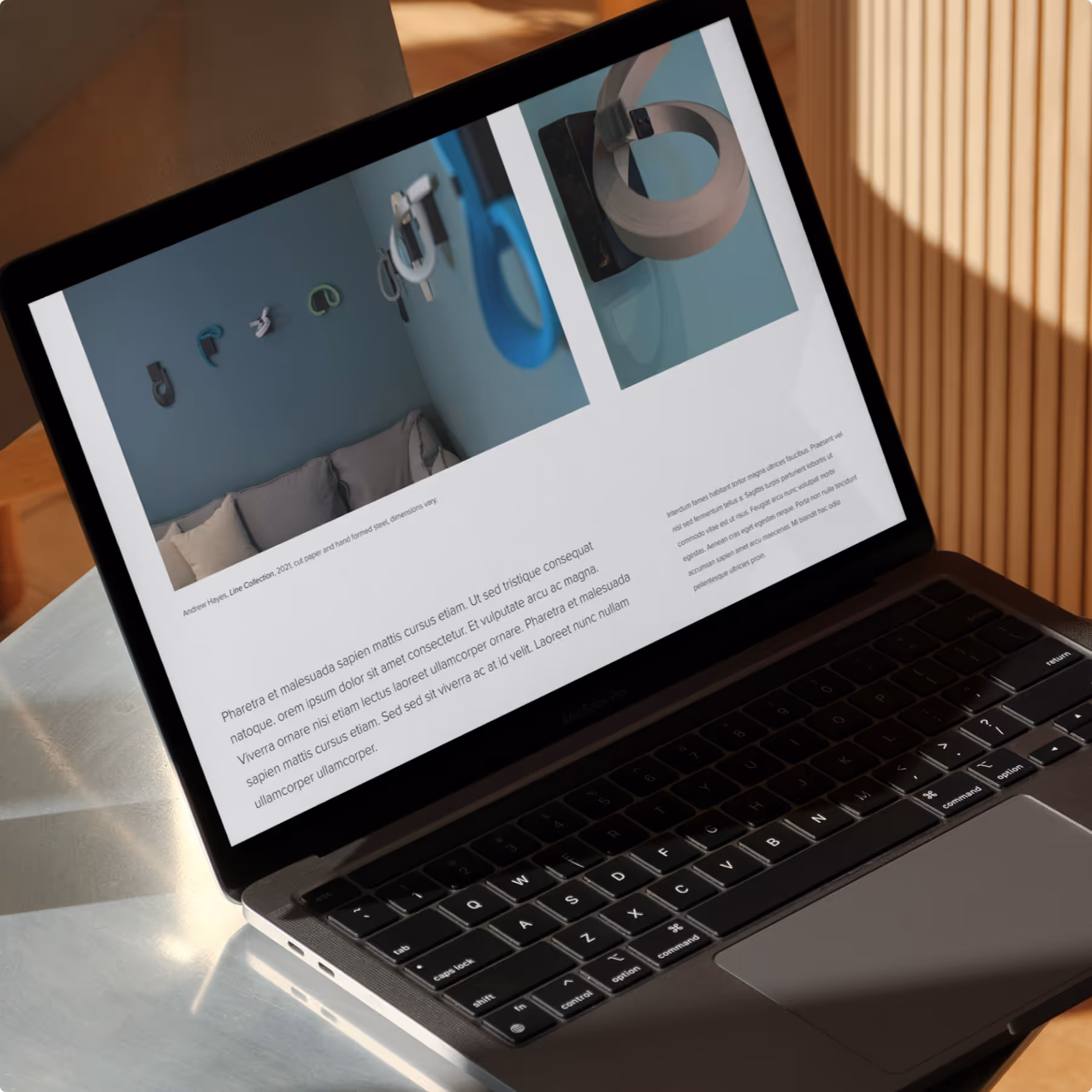
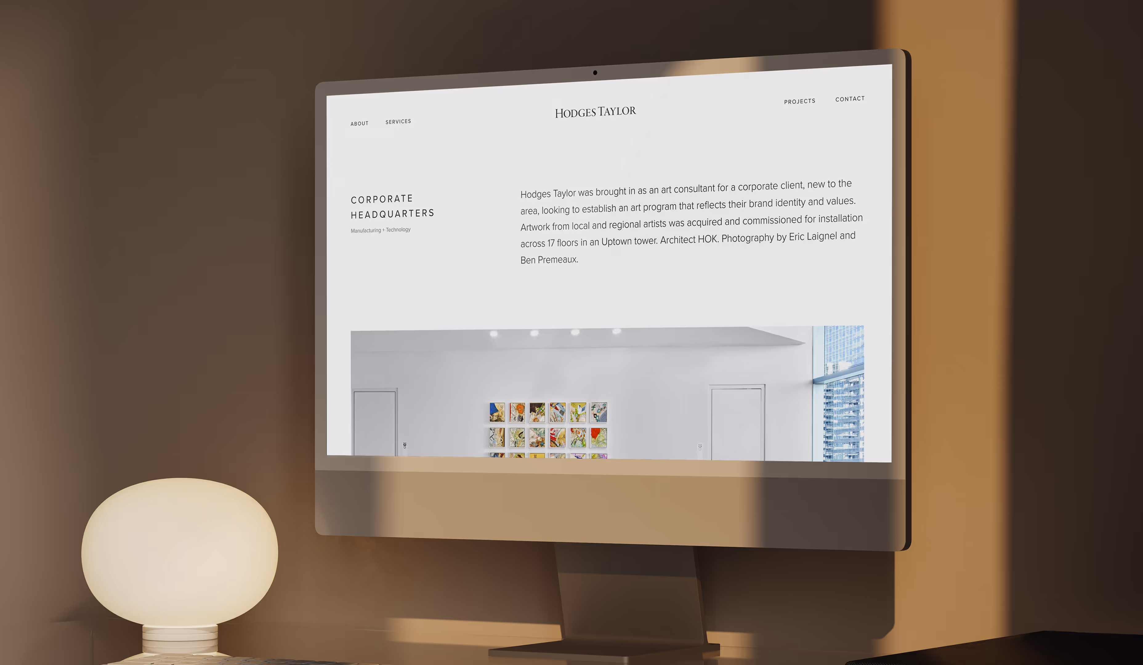
We began by redefining the messaging and content structure, shaping language that better captured the heart of their work: collaboration, curation, and a thoughtful approach to art advisory. With those foundations in place, we designed a website that embraced their minimal brand and elevated it through careful typography, generous spacing, and a gallery-like composition. The design offered a sense of calm and intention, allowing their projects and process to take center stage.
Behind the scenes, we built the site on a flexible CMS so the Hodges Taylor team could update content without sacrificing design integrity. We optimized performance, refined the interface, and ensured the experience translated seamlessly across devices. Once launched, we continued supporting the site through ongoing hosting and maintenance so it could stay as polished and dependable as the work they do for their clients.