Master Website Conversion Design terms with this survival guide for higher conversions. Learn UX psychology, trust signals, and CTA tactics.

.svg)


Website Conversion Design is the practice of shaping a website so visitors can quickly understand an offer, trust the brand, and take one clear next step. It combines useful copy, visual hierarchy, fast loading pages, simple forms, and focused calls-to-action to reduce hesitation.
Start with these basics:
A polished website can still underperform if visitors cannot tell where to click, why the offer matters, or whether they can trust the business. Strong conversion design balances aesthetic appeal with usability, so every page feels clear, credible, and easy to use. For more planning guidance, see our Custom Website Design Guide 2026.
I am Ben Visser, founder of Social Design House, a Charlotte-based creative studio that has helped growth-focused brands with strategy, identity, and website work since 2009. With more than 15 years in design, I focus on Website Conversion Design that helps brands find clarity, reduce friction, and grow with purpose.
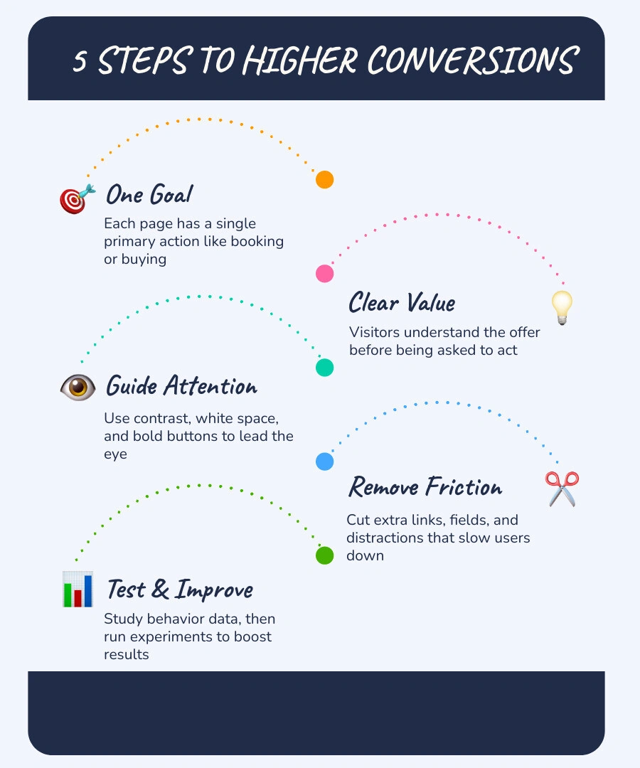
Website conversion design is the discipline of creating web pages that turn casual visitors into active leads, subscribers, or buyers. Many businesses invest heavily in driving paid traffic, social visitors, and search clicks to their pages, only to see high bounce rates and low sales. The gap between your marketing campaigns and your website is often where interest is lost.
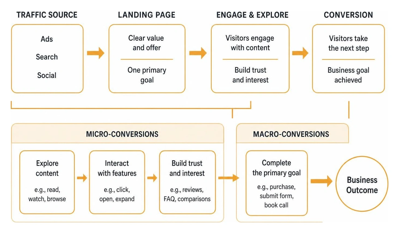
Every visitor steps onto your website with an objective. Conversion design builds a seamless post-click journey, connecting the exact promise made in an ad or search result directly to the page content. Within this framework, we measure two types of actions:
Applying the core principles of conversion-centered design helps ensure that every layout choice, headline, and button works together to support these user actions without unnecessary visual noise.
Design influences human behavior through psychology. When a person visits a webpage, their brain processes visual patterns in milliseconds. If a layout feels chaotic, cognitive load spikes and decision paralysis sets in. Visitors will leave rather than try to decipher an overwhelming page.
Clear visual structure creates cognitive fluency, which is the ease with which our minds process information. By mapping out content with the classic AIDA model (Awareness, Interest, Desire, Action), we guide visitors step-by-step through their decision journey:
Understanding user intent is essential to this structure. As we discuss in our breakdown of What's the Difference Between UX Strategy and UX Design?, thoughtful strategy determines what should be built to serve customer needs, while design shapes how those elements function and feel.
Effective design choices come from real user behavior rather than guesswork. Watching how actual visitors interact with your pages uncovers hidden stumbling blocks.
We look closely at several analytical methods:
If you are curious about how these data sources fit together, our overview on How Do Analytics Factor into Your UX Work? shares practical insights on transforming raw metrics into meaningful interface updates.
Persuasive user experience focuses on removing obstacles between a visitor and their goal. Every unnecessary click, confusing menu, or slow-loading asset introduces friction.
Page speed is one of the most significant technical drivers of conversion. Pages that load in under three seconds convert at twice the rate of slower pages, and strong Core Web Vitals scores directly support engagement.
Here is how high-friction elements compare to conversion-friendly alternatives:
| User Experience Factor | High-Friction Approach | Low-Friction Conversion Design |
|---|---|---|
| Page Navigation | 15+ links, complex multi-level drop-downs | Streamlined menu or isolated 1:1 attention ratio |
| Form Layout | 8+ required fields on a single, long screen | 2 to 4 essential fields or clear multi-step form |
| Call-to-Action | Generic "Submit" button blending with the background | Action-oriented text ("Get My Free Guide") with high color contrast |
| Visual Flow | Dense text blocks with scattered images | Scannable headers, ample white space, and clear focal points |
| Social Proof | Generic text quotes without attribution | Detailed testimonials with headshots, company names, and star ratings |
Building an intuitive site starts with a structured Digital User Experience Strategy that aligns your business goals with clear usability standards.
Attention ratio represents the relationship between the number of interactive elements on a page and the number of conversion goals. On dedicated landing pages, aiming for a 1:1 attention ratio creates optimal focus. Removing extraneous header links, social icons, and sidebar menus keeps attention squarely on the primary offer. Research shows that landing pages with a strict 1:1 attention ratio can achieve conversion rates as high as 46.86%.
Eye-tracking studies demonstrate that web visitors scan pages in predictable patterns:
Mapping out these paths in wireframe blueprints before finalizing visual assets ensures that visitors encounter your core value proposition and call-to-action naturally.
Visitors experience natural risk aversion when interacting with a new business. Trust signals provide the reassurance needed to overcome doubt.
Key trust elements include:
The visual composition of a page directs how eyes move across the screen. Applying visual hierarchy ensures that key information stands out clearly. For instance, Underwater Audio improved its sales by 35.6% simply by reordering and clarifying the visual hierarchy on its homepage.

When we build digital products through our Website Design and Development work, we isolate calls-to-action inside dedicated visual containers. This clear containment ensures buttons are unmissable. Using directional cues, such as subtle arrows or hero imagery where a person looks toward the CTA button, helps guide visitor attention directly to the desired action.
Visual clarity is a gift to your website visitors. Three core techniques make this work:
When elements have proper spacing and contrasting colors, visitors process offers faster. If you want to explore more methods for turning visitors into qualified inquiries, review our answers on How Do You Help Generate Leads Online?.
Mobile devices generate over half of all web traffic. Designing for mobile screens requires careful attention to touch interactions and compact layouts.
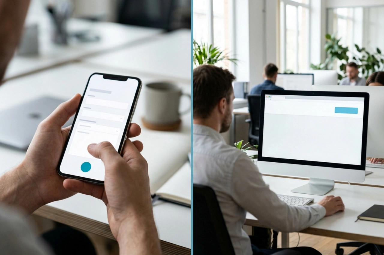
Essential mobile optimization tactics include:
Conversion optimization is an ongoing process of learning and refinement. A/B testing allows teams to compare two versions of a single element, such as a headline, button color, hero image, or form layout, to determine which one produces better results.
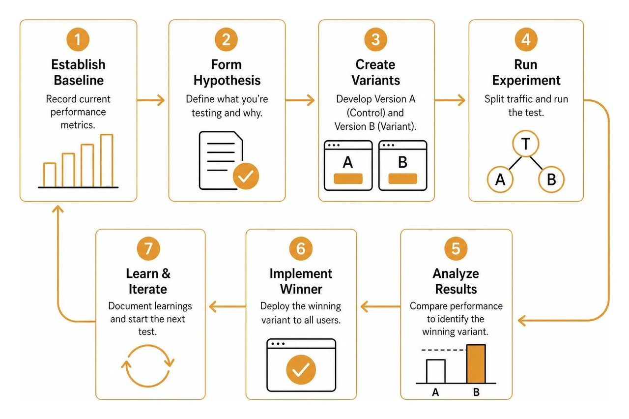
Follow this testing approach for reliable insights:
The ideal attention ratio on a campaign landing page is 1:1. That means for every page goal, there is only one primary interactive action available. Removing header links, footer directories, and off-page promotions prevents visitors from getting distracted and abandoning the conversion funnel.
Micro-interactions provide immediate visual feedback that confirms user actions. Subtle button hover states, progress bars during multi-step forms, and loading spinners reassure visitors that the site is working properly, which reduces uncertainty and keeps users moving smoothly through the experience.
Visual aesthetics build brand affinity, while functional UX ensures that visitors can complete tasks effortlessly. Prioritizing beauty over usability creates confusion, while ignoring brand identity diminishes credibility. Balancing clean visual design with intuitive layouts produces an engaging, trustworthy, and effective experience.
Building high-converting digital experiences is simple, not easy. It takes clear messaging, disciplined visual structure, and a deep understanding of user behavior. When you eliminate friction and prioritize clarity, your website becomes an active growth engine.
Social Design House is a Charlotte-based 10-person creative studio with 16 years of experience operating as a fractional creative team. We build brand identities, craft strategies, design custom websites in Webflow and WordPress, write copy, manage performance marketing, and use our AI Brand Framework to help companies grow with purpose.
We are pumped to help you clarify your messaging, refine your user journeys, and find your sweet spot. Explore our work and team at Social Design House. Excited to continue sharing new insights and building really, really great web experiences together.