Challenge
Matrix Consulting Group had invested years of recognition in their existing logo, but it no longer reflected who they were. The brand needed a careful update, not a total departure, and the new identity had to balance familiarity with a modern edge. At the same time, their website lagged behind—functional but uninspiring, and not doing justice to the depth of their expertise.
Solution
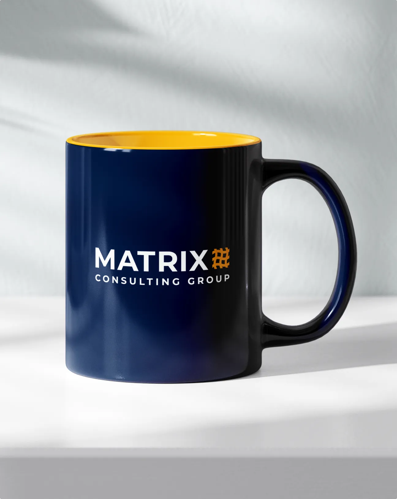
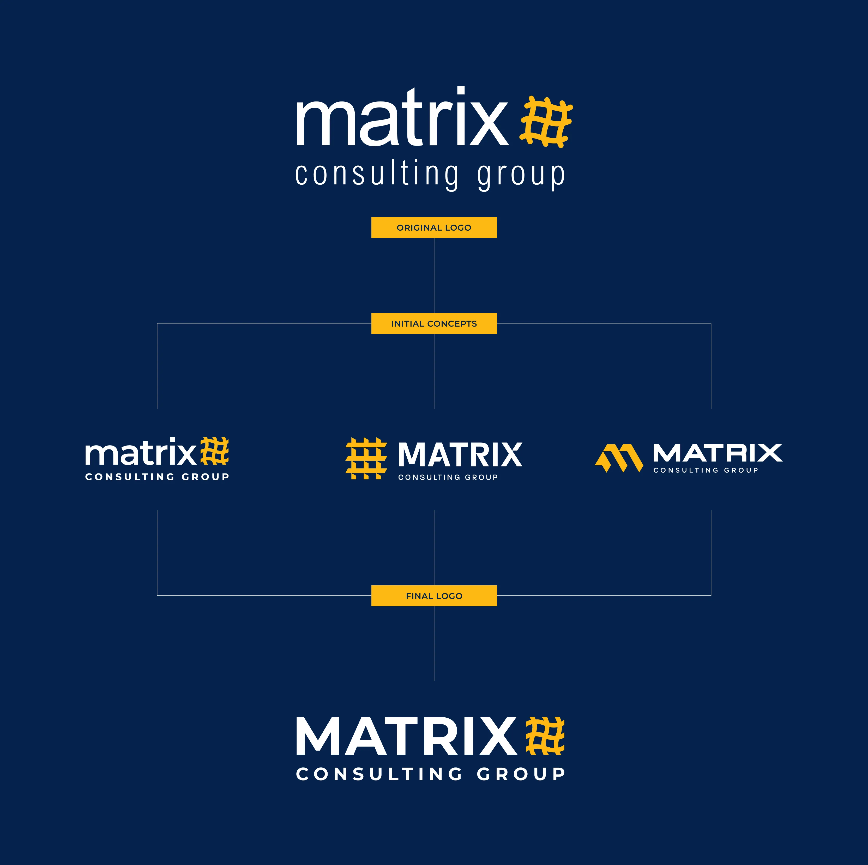
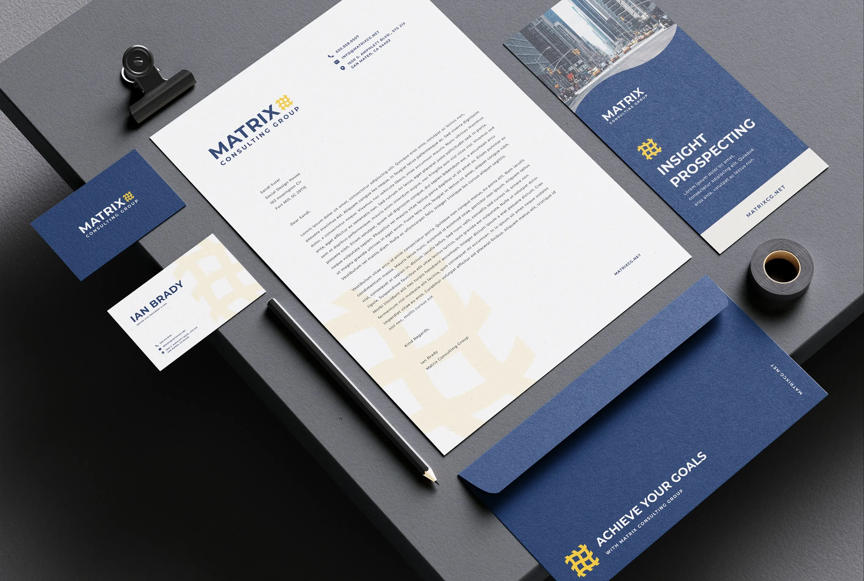
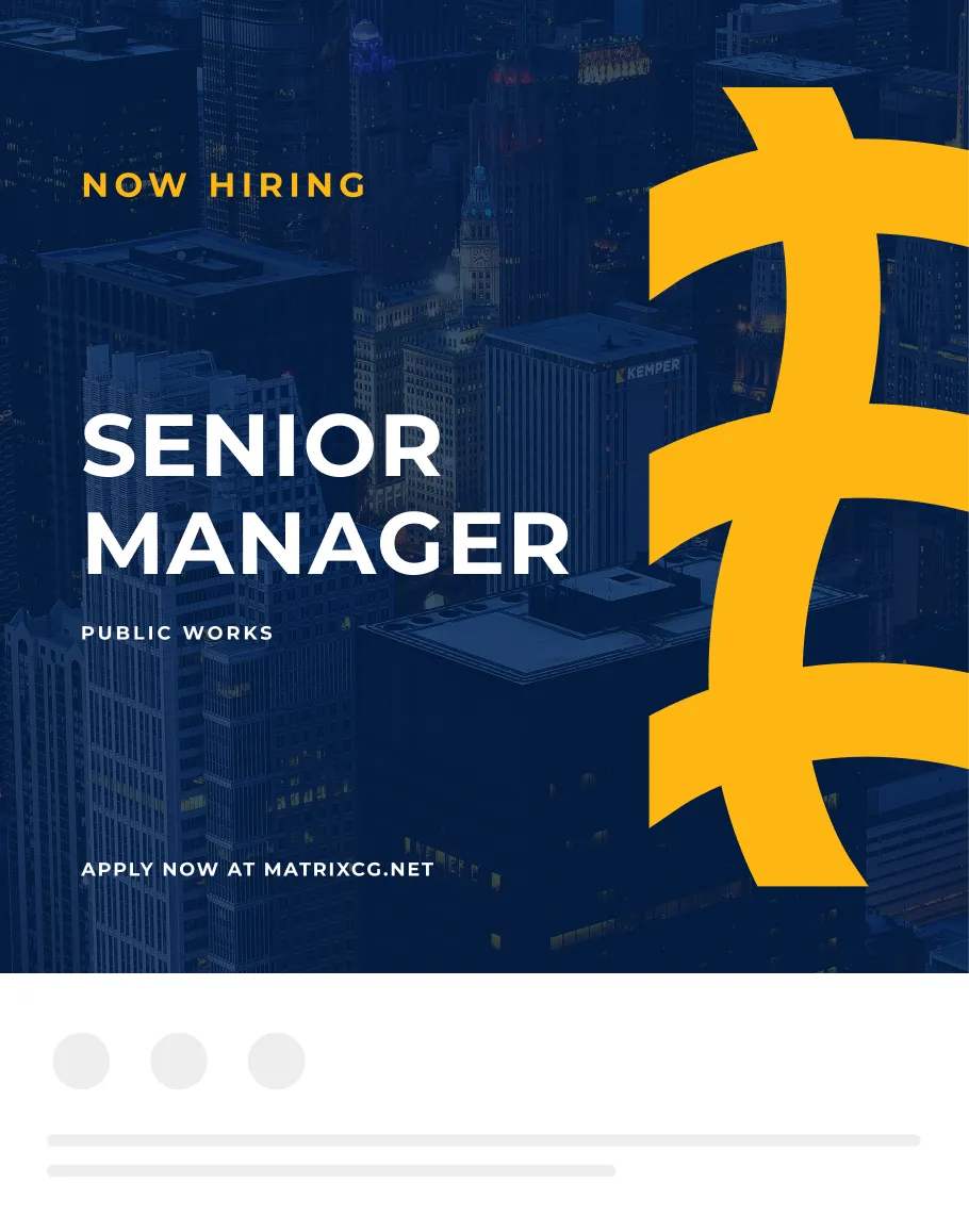
We started by presenting three logo directions, ranging from subtle refinements to bold reinventions. This gave the Matrix team control over how far they wanted to stretch while still modernizing. In the end, we refreshed their mark with sharper lines, stronger typography, and a more contemporary balance. It honored the original without feeling trapped by it.
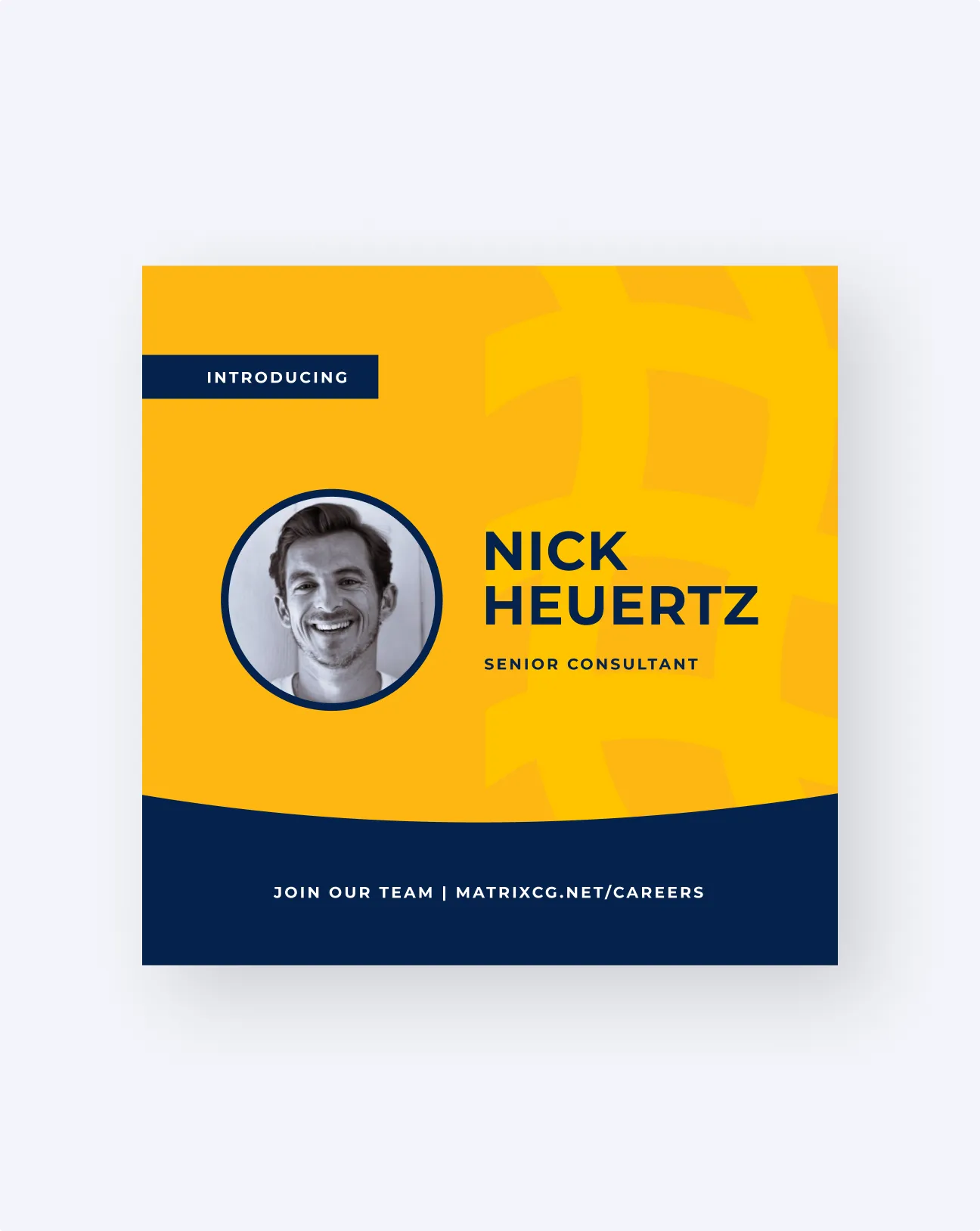
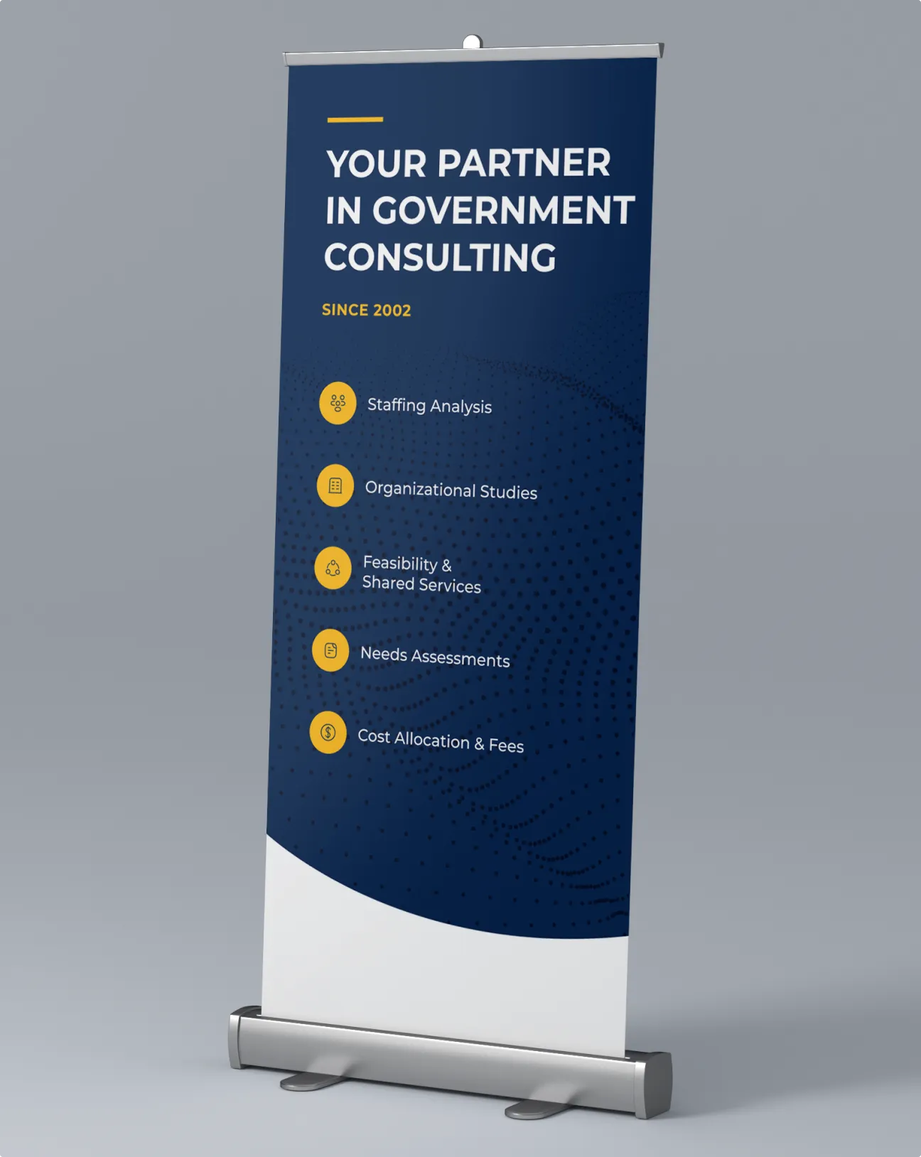
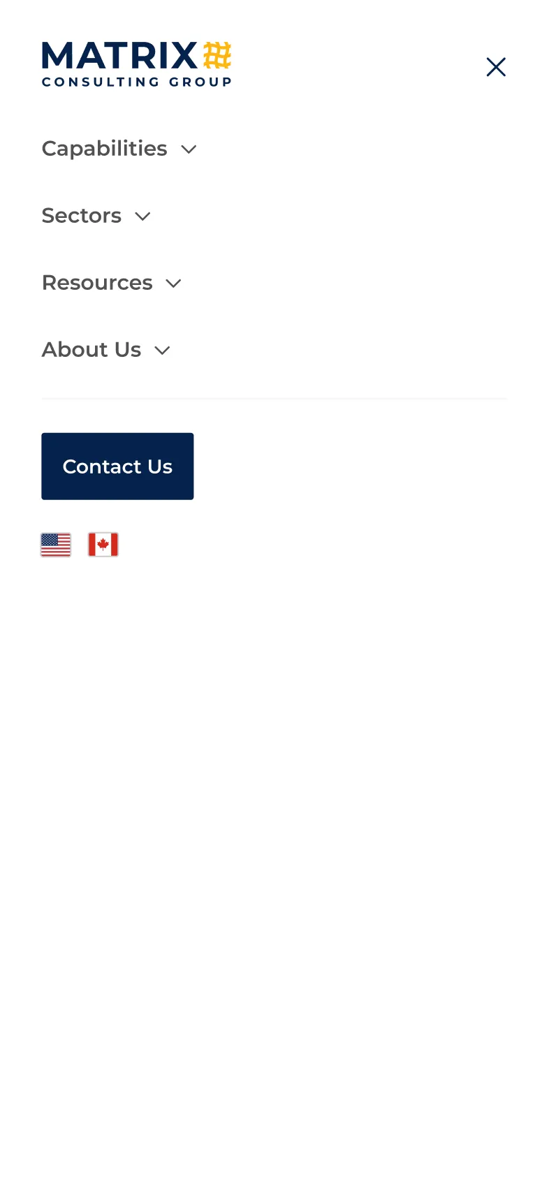
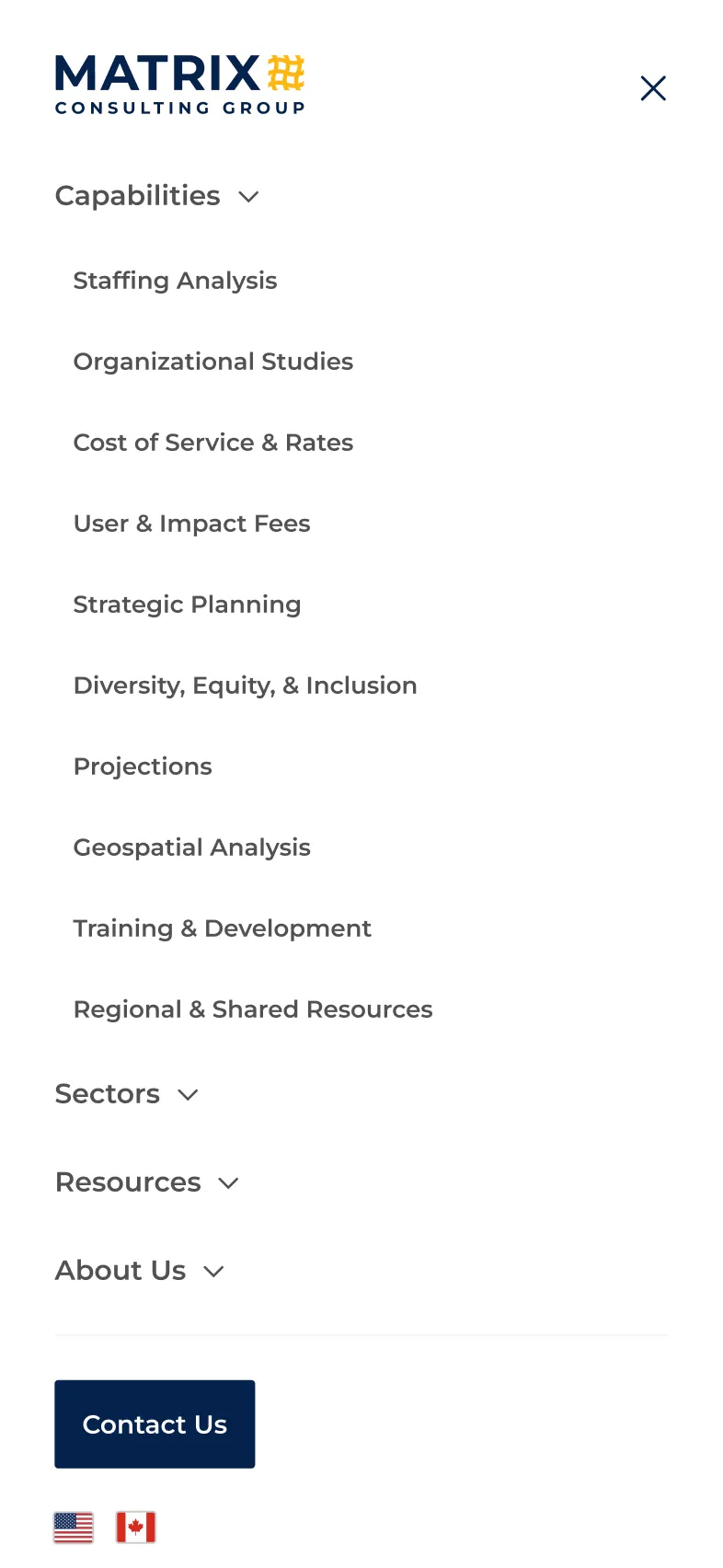
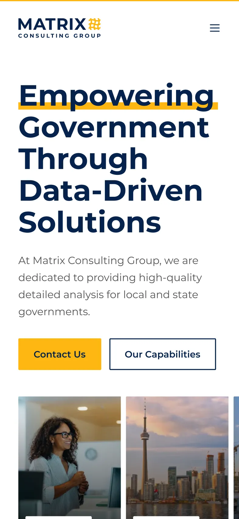
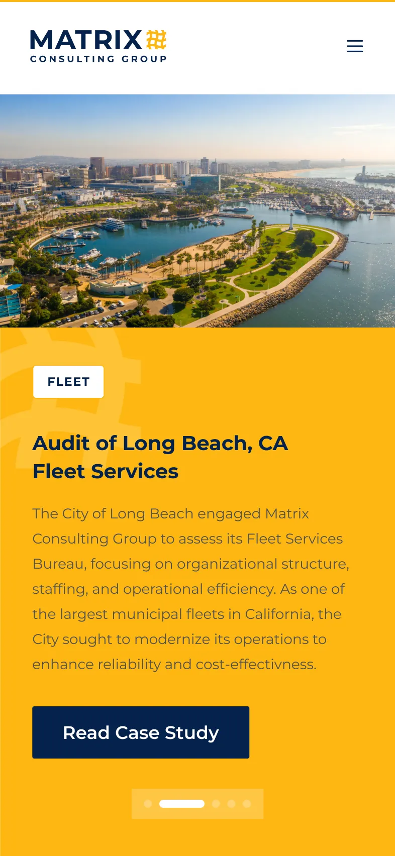
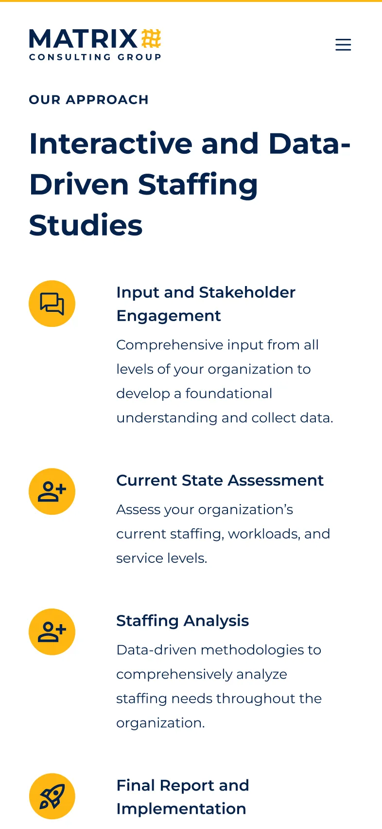
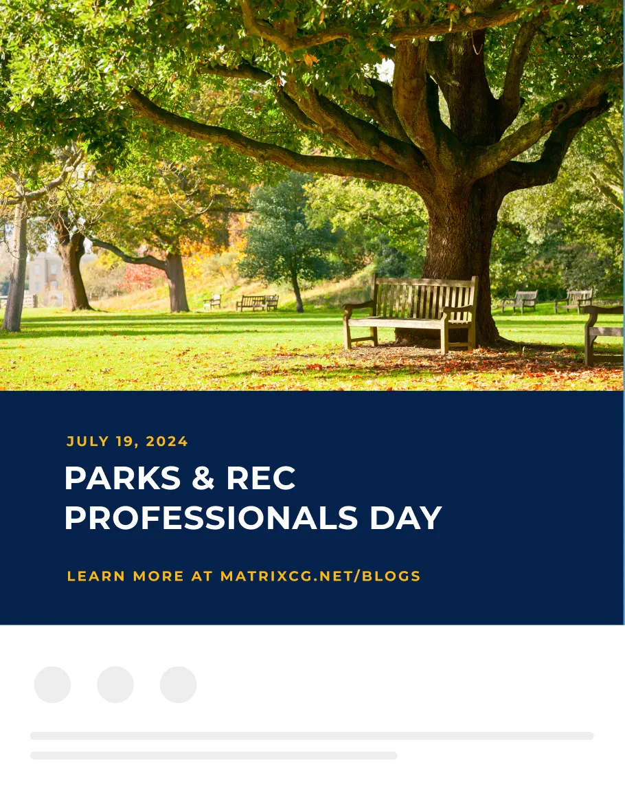
Color became the lever for breathing new life into the system. A brighter palette paired with a modernized website gave the brand the energy it was missing. The site was rebuilt with usability and clarity at its core, designed to showcase services, case studies, and expertise without feeling dated. The result was a refreshed identity that felt like Matrix: trusted, established, and very much alive in the present.