Challenge
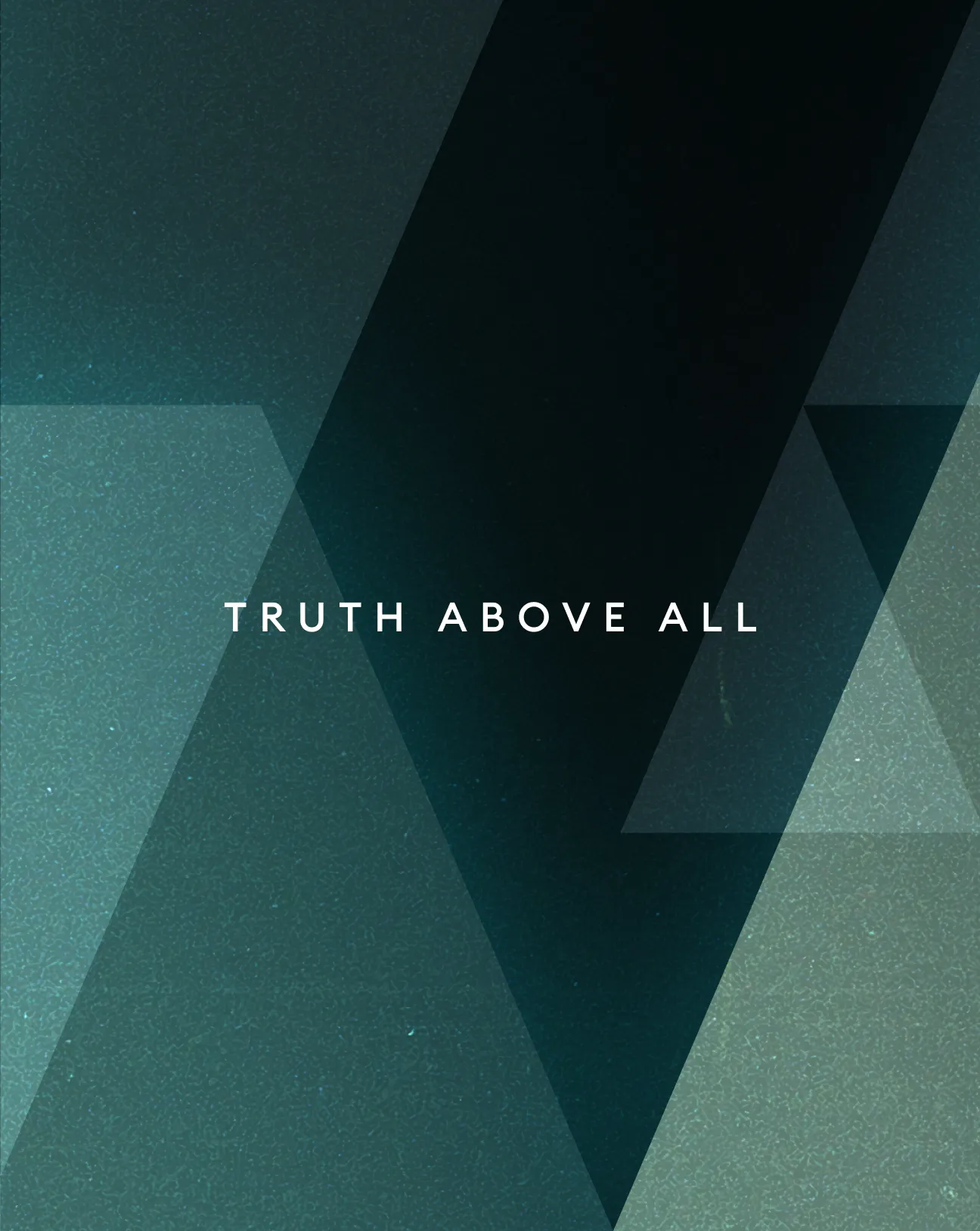
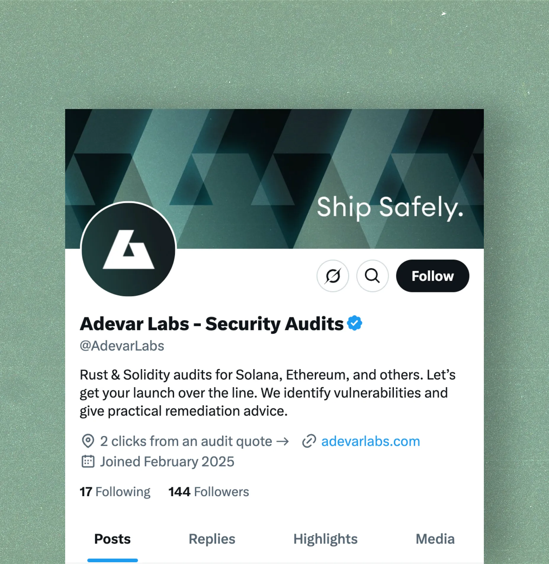
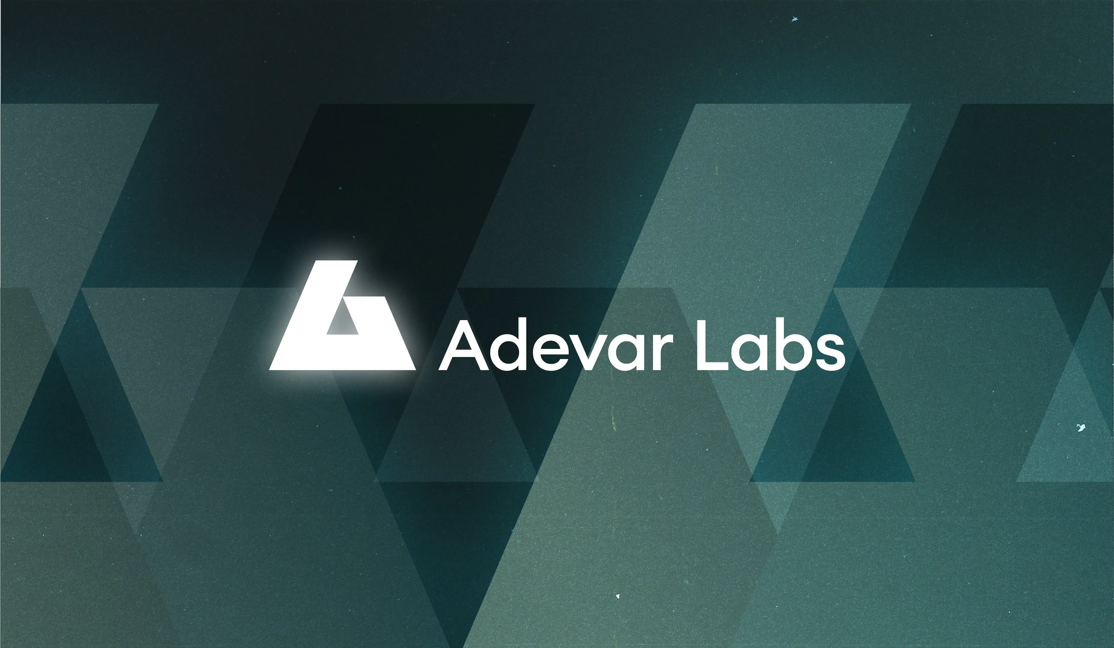
As a brand-new company, Adevar Labs entered a crowded field where everyone seemed to be shouting about the same thing. Web3 security is notoriously difficult to explain to outsiders, and the usual crutches of shields, locks, and padlocks only made matters worse. The founders wanted something smarter, more original, and rooted in their name: "Adevar," the Romanian word for truth. The task was to cut through the noise with an identity that felt trustworthy without blending into the background.
Solution
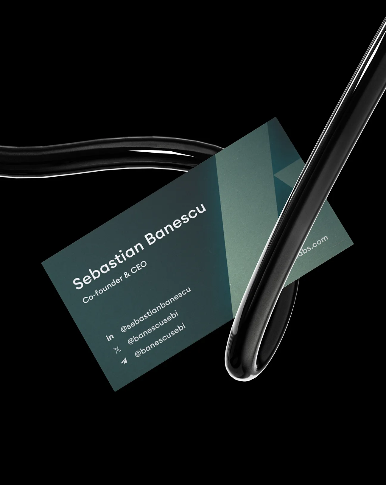
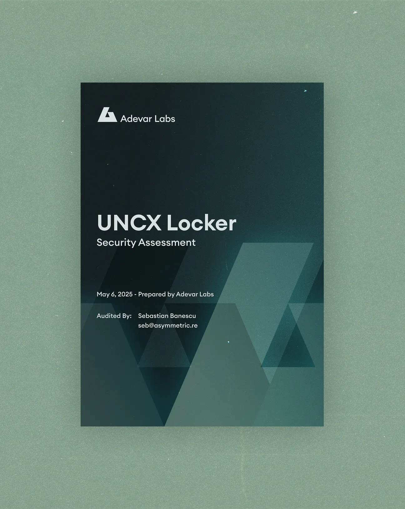
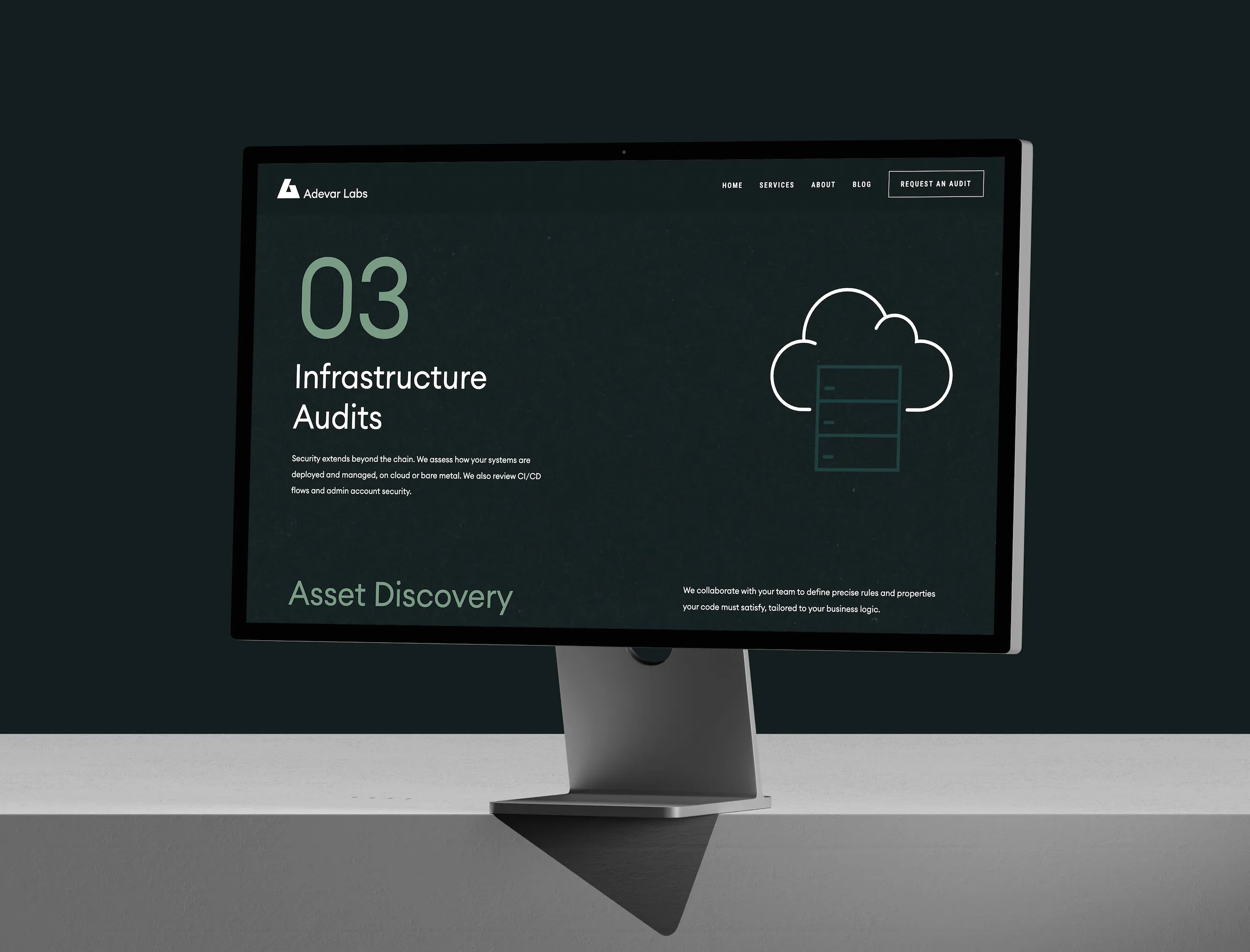
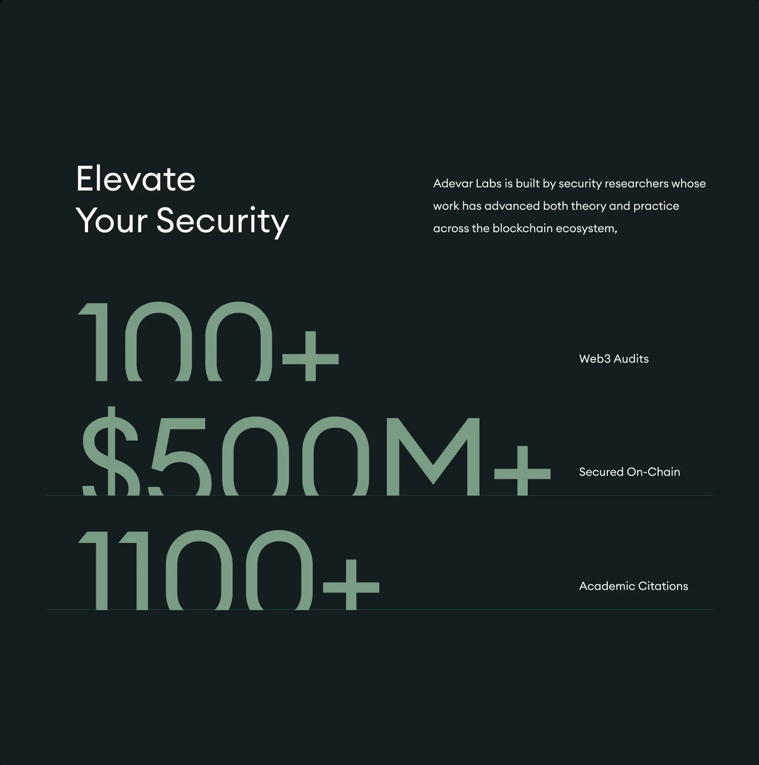
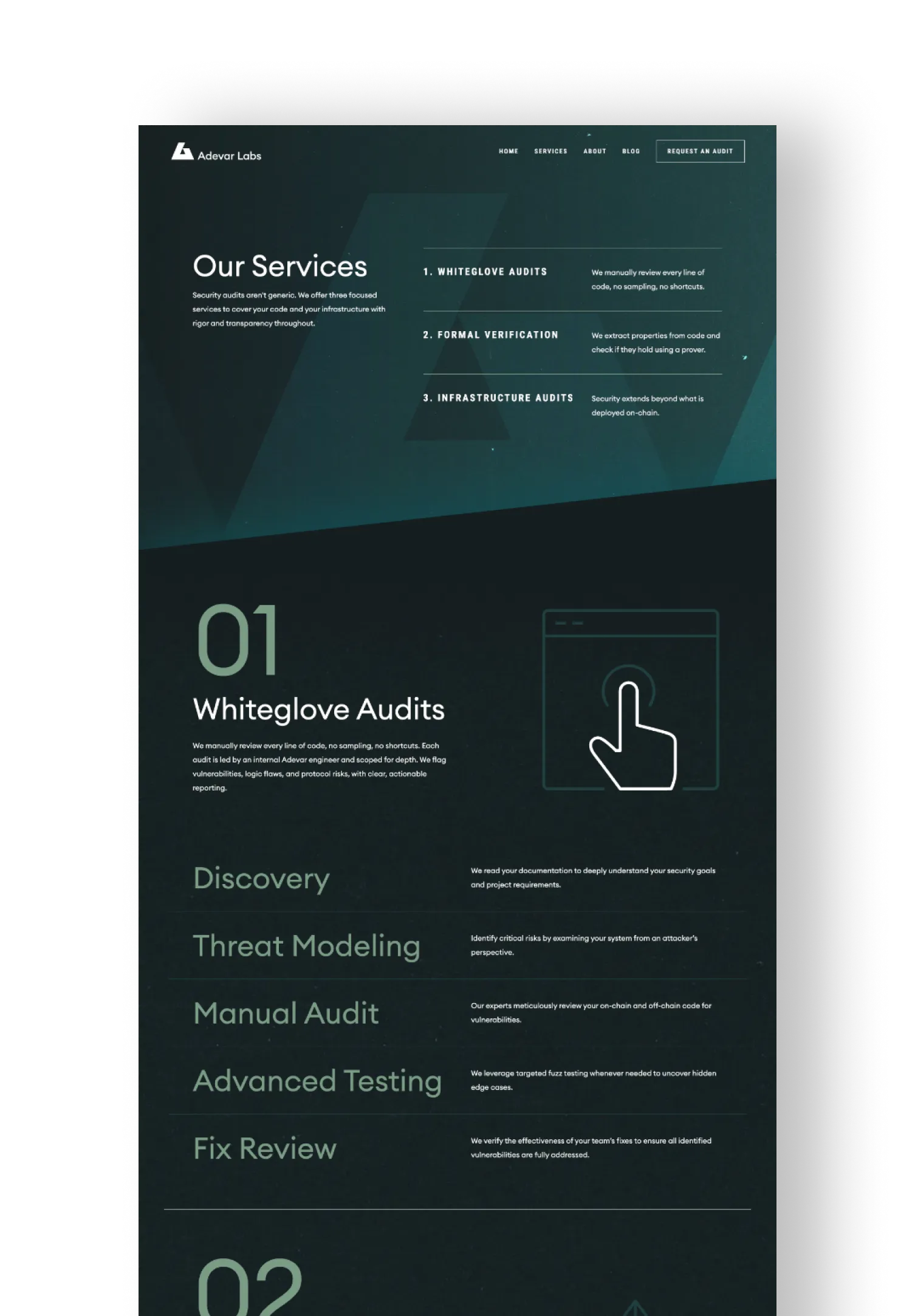
We began with the name itself, letting "truth" guide the design. The visual identity leaned into geometric shapes and layered gradients, creating a sense of precision and depth without resorting to cliché imagery. The typography was kept minimal and contemporary, striking a balance between authority and approachability. Together, these elements worked to make Web3 security feel less opaque and more like a conversation you could actually follow.
The website carried that same clarity forward. It was designed to explain Adevar Labs’ services without overwhelming, combining sharp visuals with clean layouts and carefully chosen words. In a space where competitors relied on technical jargon and recycled symbols, Adevar Labs stood apart. The brand told a story of transparency and expertise, proof that even in the most complex industries, simplicity can be the ultimate differentiator.