Challenge
Movement was growing into the education space, but their brand hadn’t made the leap with them. They needed more than a logo, they needed a full identity system that could flex across multiple campuses. It had to feel related to the parent company without confusing families into thinking they were signing up for a mortgage. The website also carried a heavy load, serving as both an introduction to prospective families and a resource hub for the ones already enrolled.
Solution
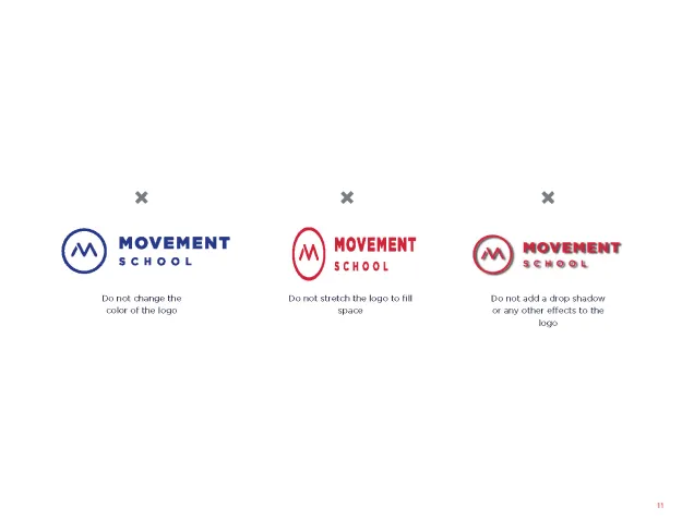
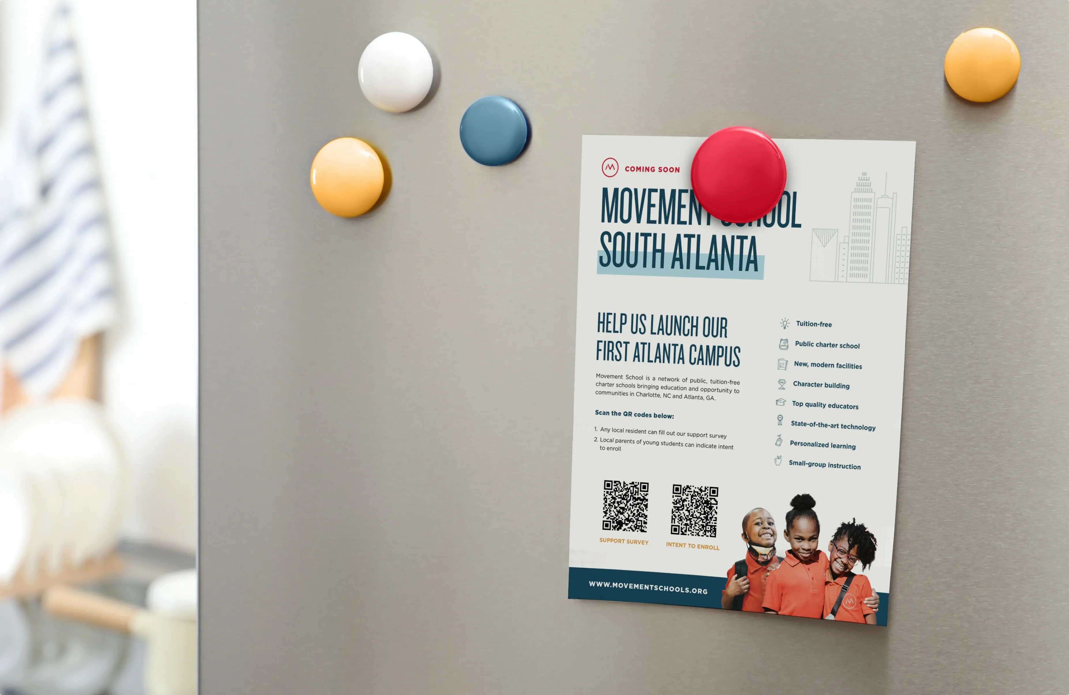
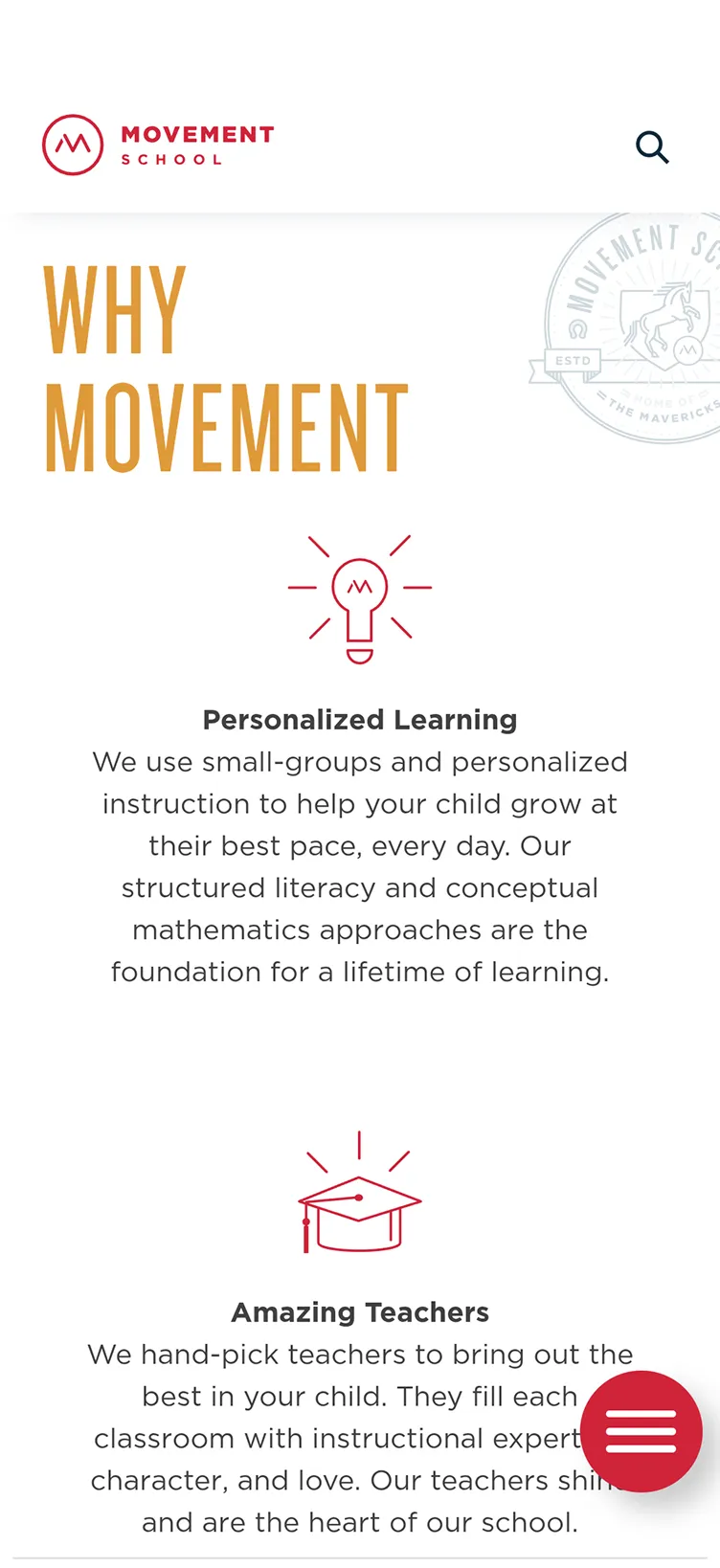
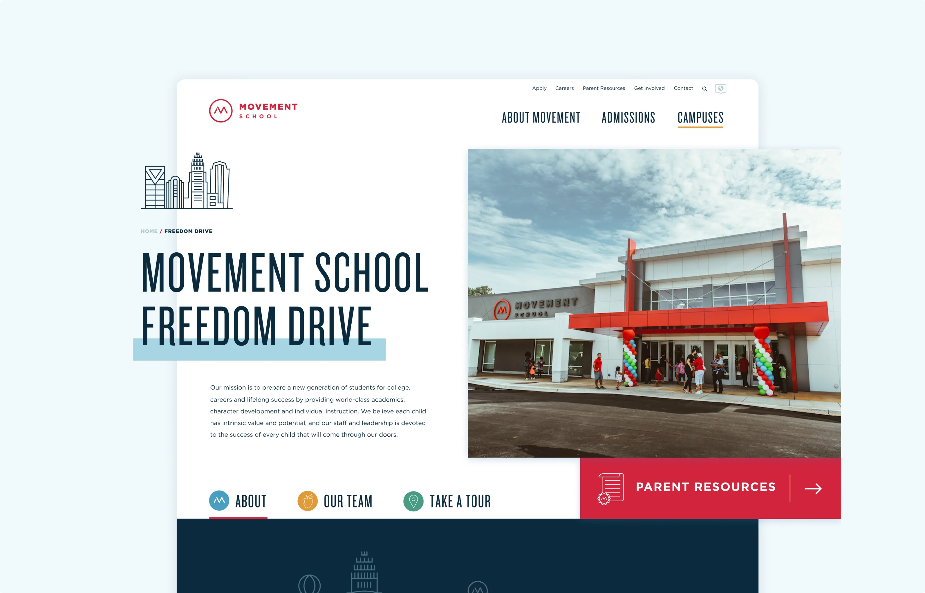
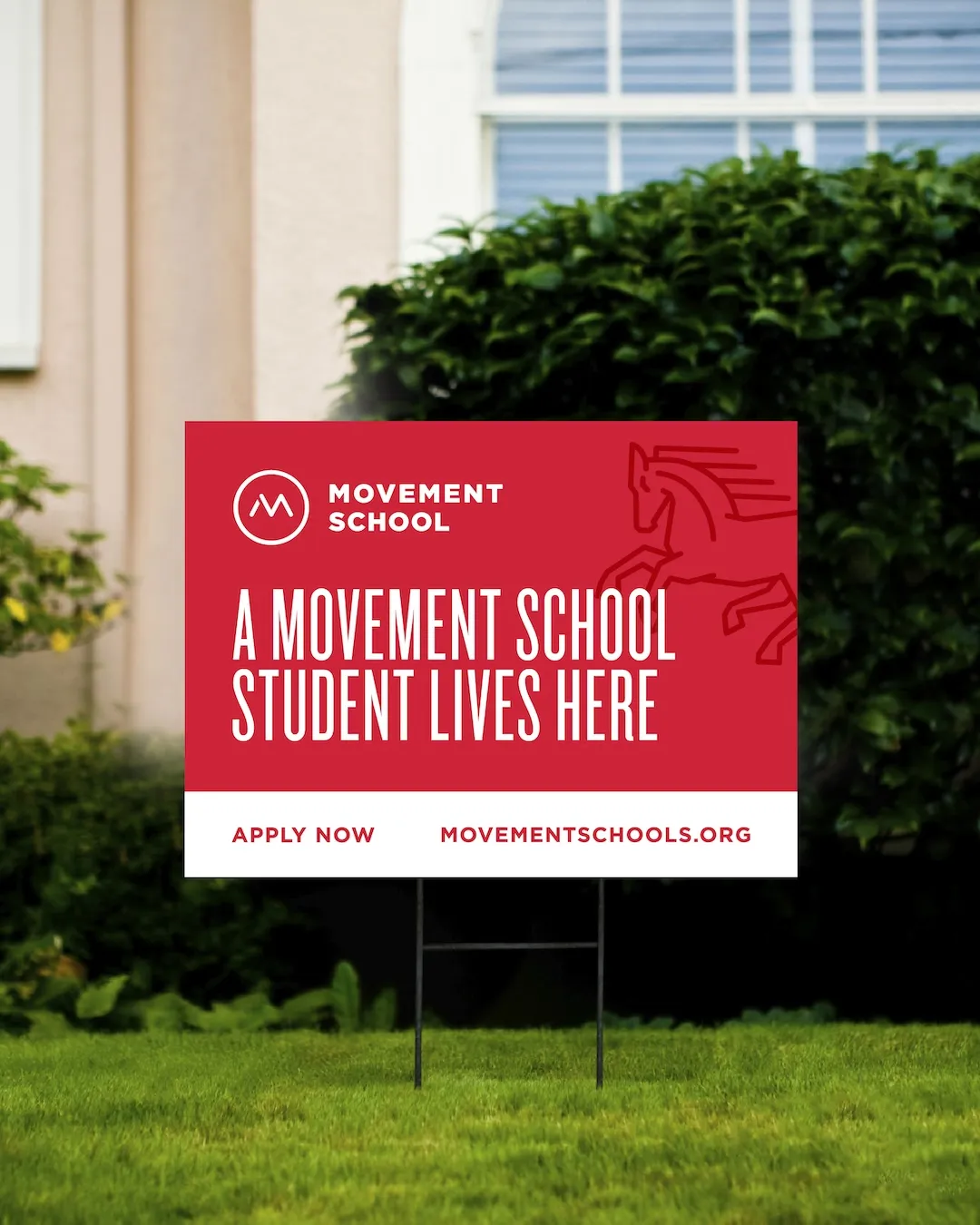
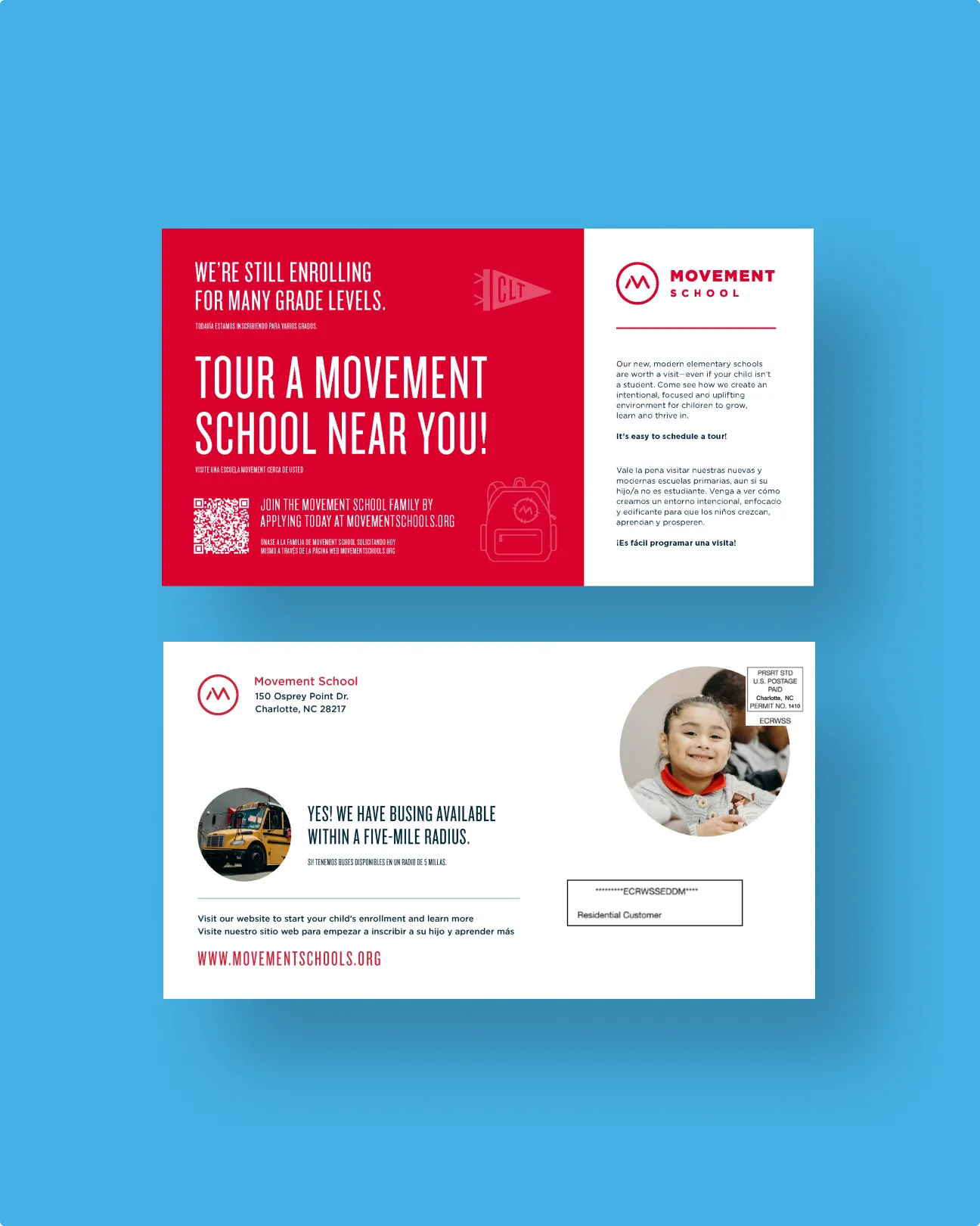
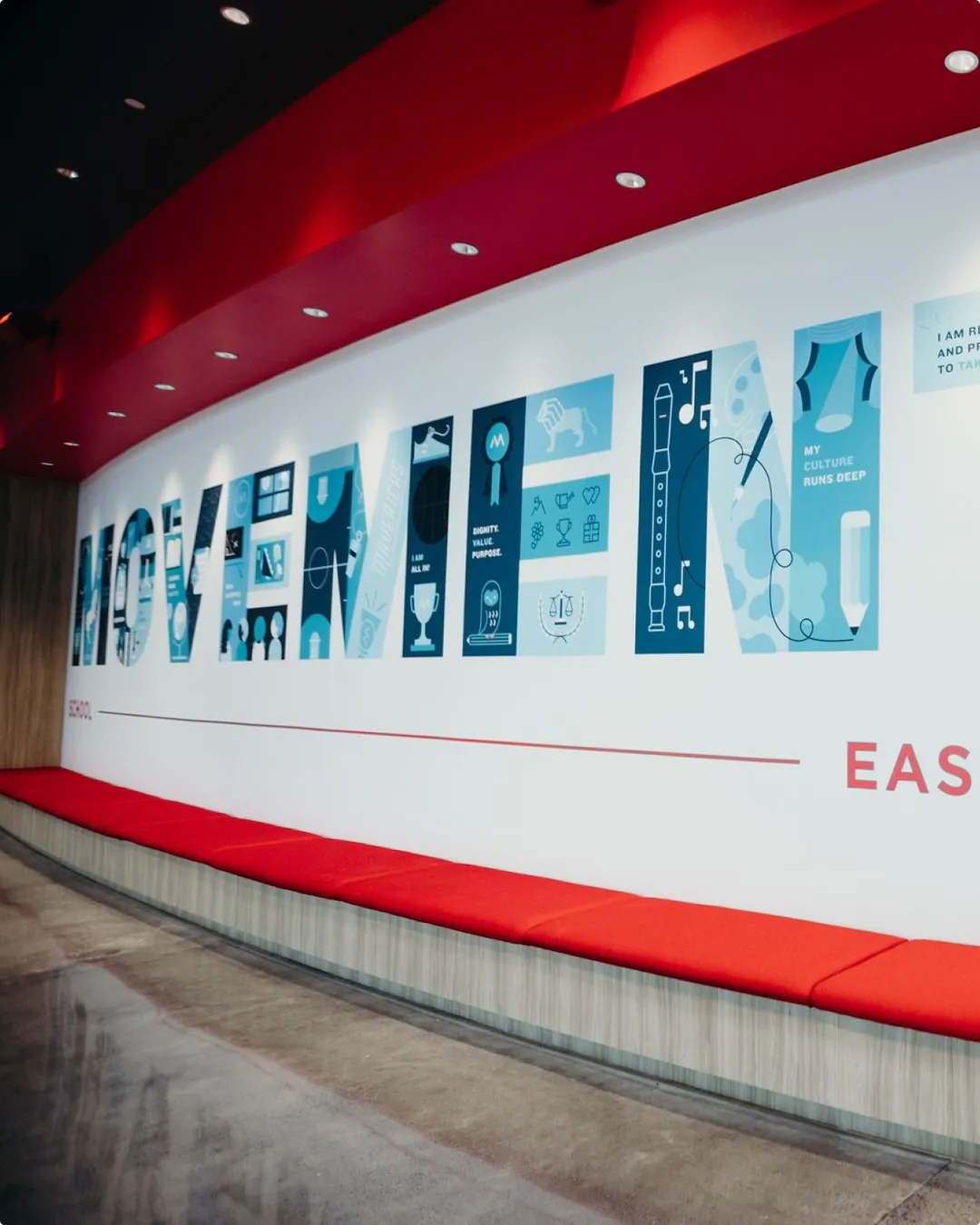
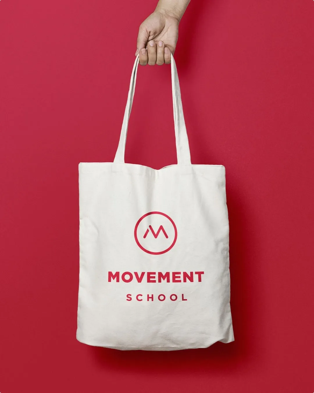
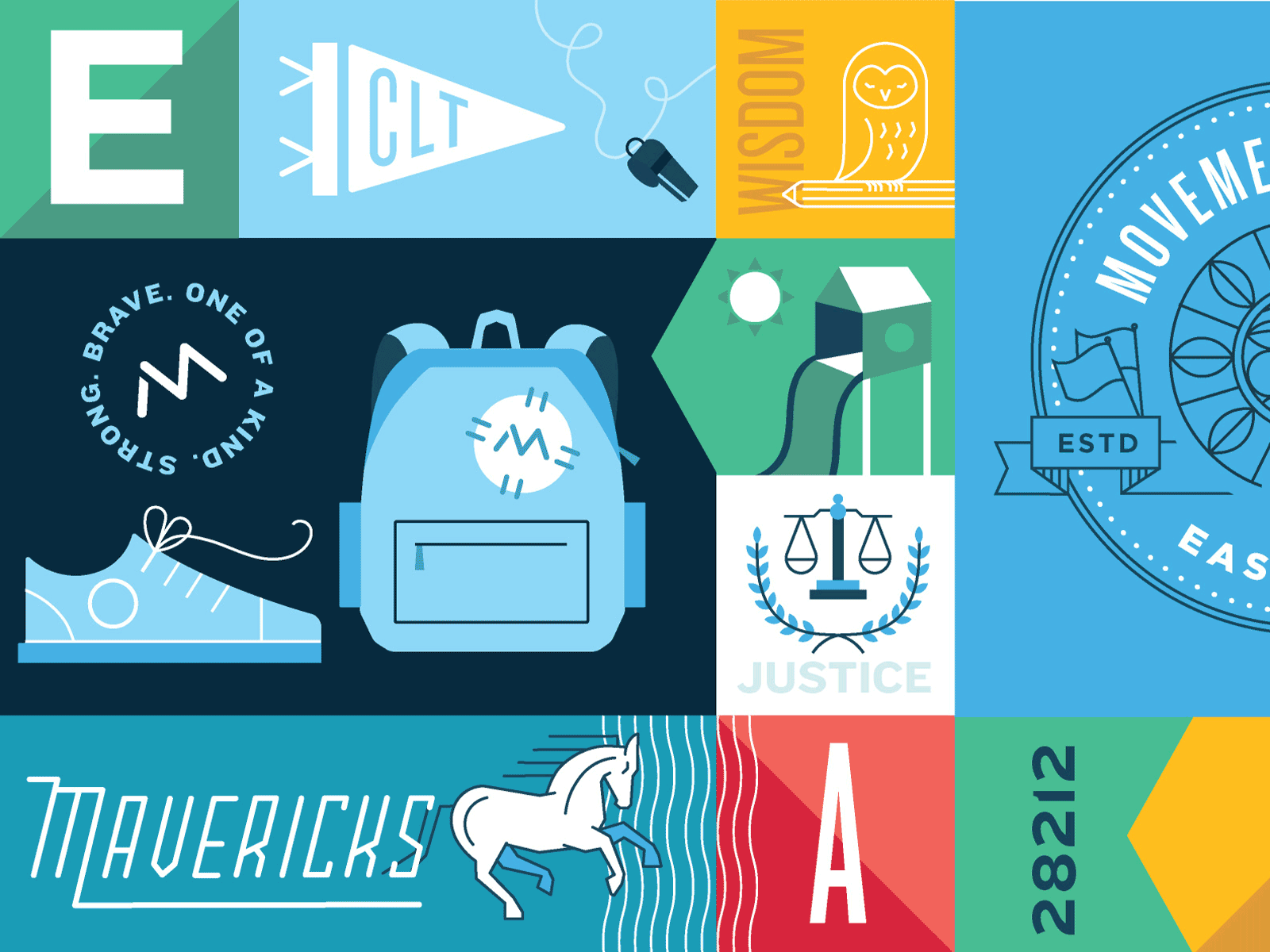
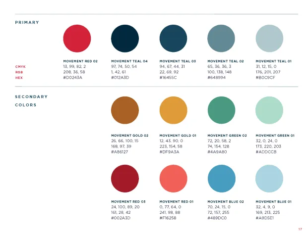
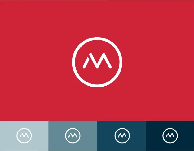
We designed a brand system built for scale. That meant bright, flexible colors, playful custom illustrations, and a type system that could be warm in the classroom but serious in the boardroom. School-specific crests gave each campus its own personality while keeping everything tied to the larger brand. The system extended across signage, murals, mailers, swag, and guidelines, making it easy to implement and consistent at every level.
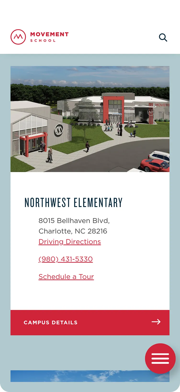
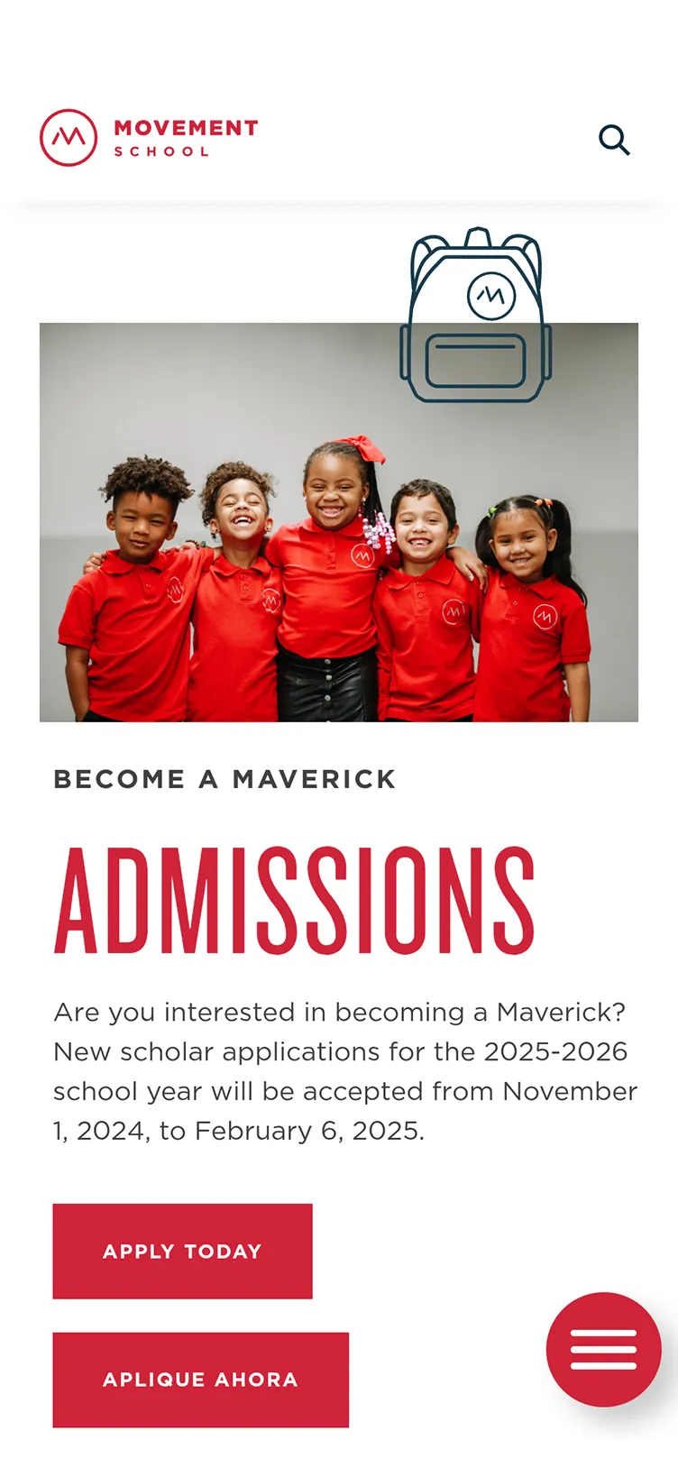
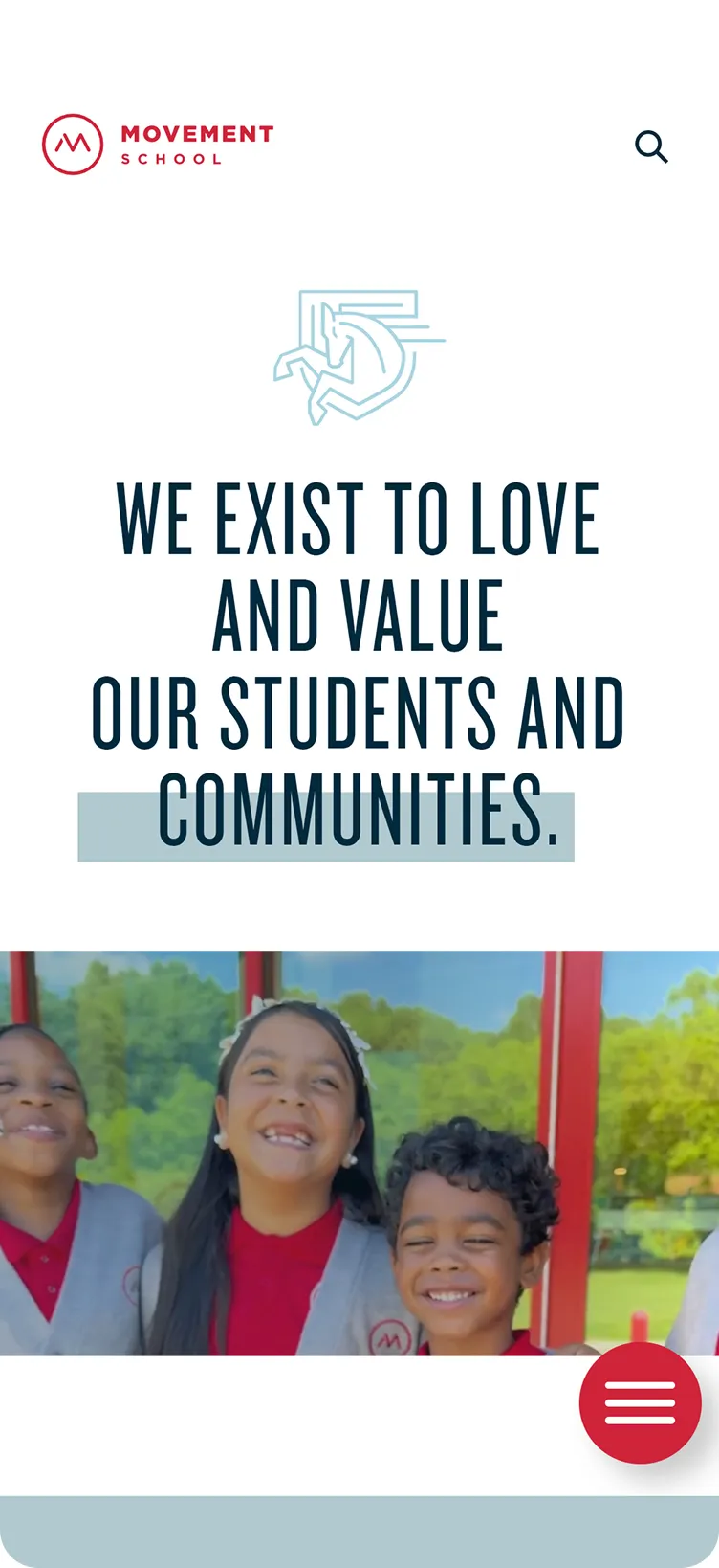
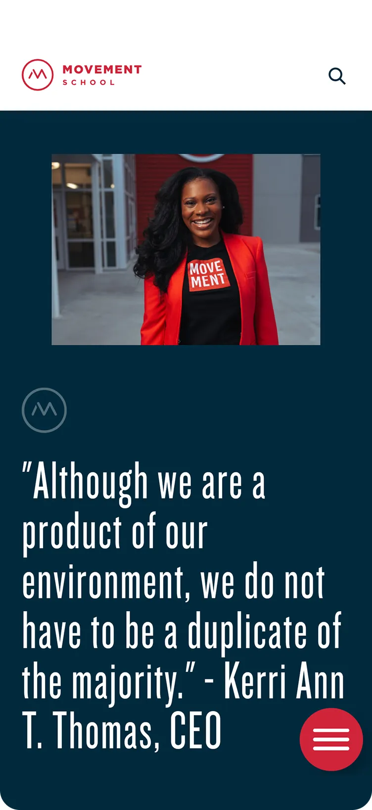
The website took the same approach: clarity first. We built a platform that delivered what parents needed without making them dig. Culture was front and center, with staff and student stories woven throughout. Behind the scenes, the system was designed to grow as quickly as the schools themselves. The result was an identity that worked as hard as the educators it represented.

![Two rows of typographic logo marks on dark blue background: the first row labeled Freedom Dr with text like 'Untamed since 2017', 'Freedom Drive', 'No. One Movement School', '20208', and a Charlotte NC skyline; the second row labeled Eastland with texts like 'Established 2020', a circular floral emblem, '2 [eight 2 one 2]', 'No. 2 Movement School', and '5249 Central Avenue'.](https://cdn.prod.website-files.com/66a1550e7e0edc2aaa98438f/679cef55e98daea00911c3ef_ms-brand-5.webp)